
Challenge
The visual identity had simply not kept pace with the business. In a market driven by design, aesthetics, and the emotional pull of beautiful materials, Hinterseer was presenting itself in a way that no longer matched what it actually delivered. The brand felt dated — and in luxury retail, that gap between the product and its presentation is costly.
The rebranding challenge was genuinely difficult: how do you modernise a brand that is defined by tradition, without losing the 120-year authority that is its most valuable asset? Wholesale reinvention would destroy what the brand had earned. Cosmetic adjustment would solve nothing.
The identity also needed to scale across the full complexity of a 28-location retailer: from exterior location signage to product packaging, from campaign posters to image catalogues, from business stationery to the smallest product label.
Solution
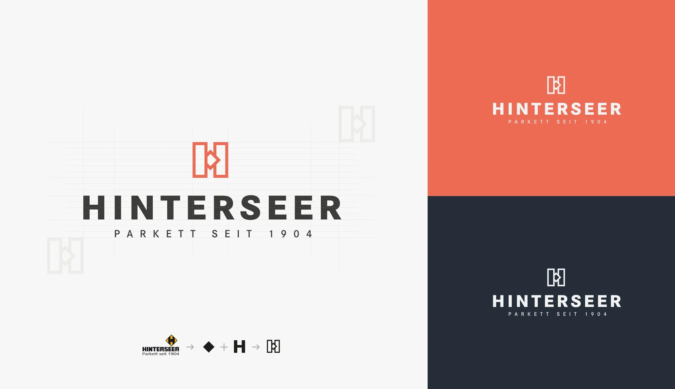
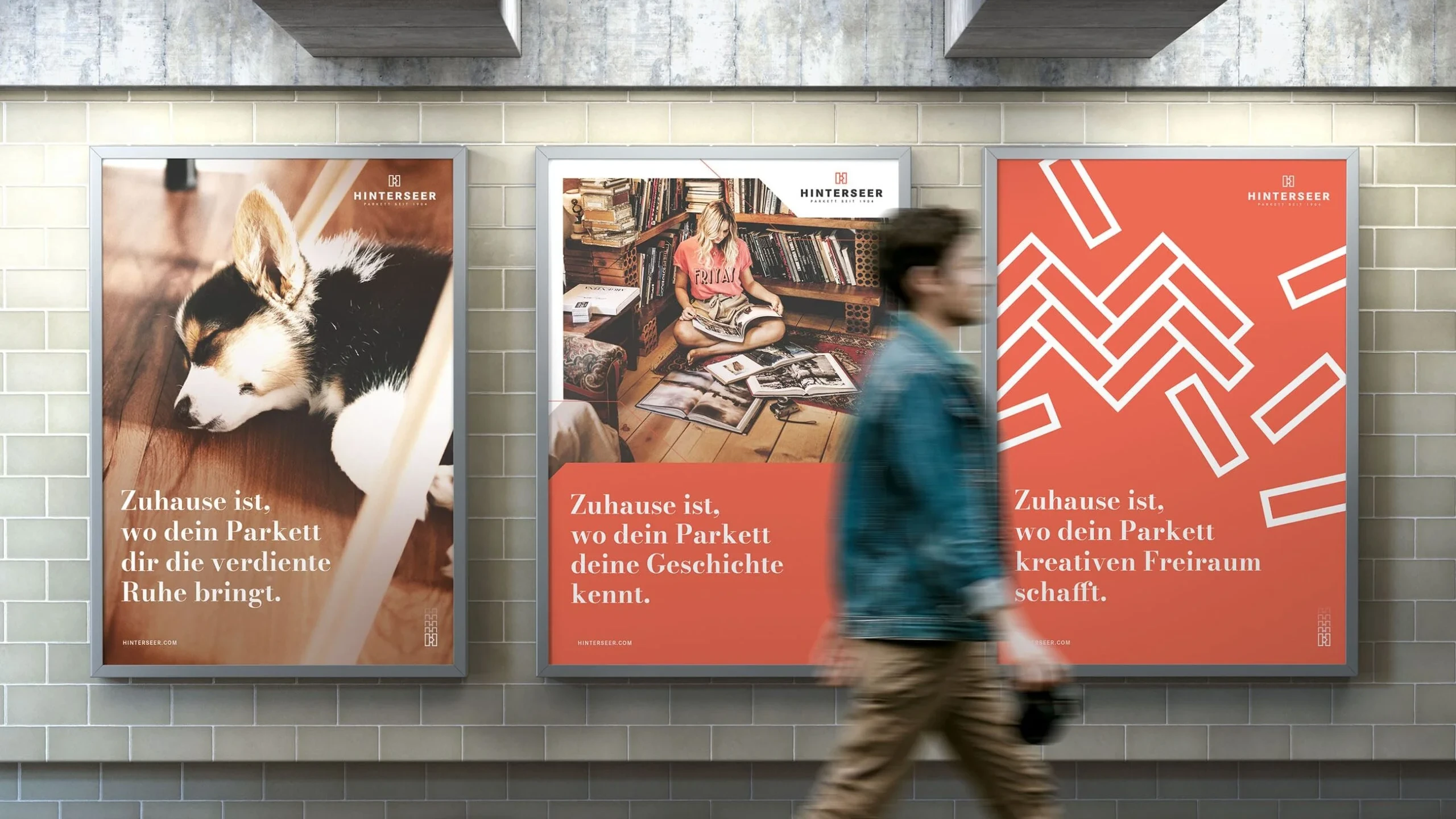
We started with the logo — a new H monogram that traces its lineage directly from the old mark but is stripped of everything that had dated it. The geometry is precise, the proportions are considered, and the mark reads with confidence at every scale. The evolution is visible: this is recognisably Hinterseer, but future-facing.
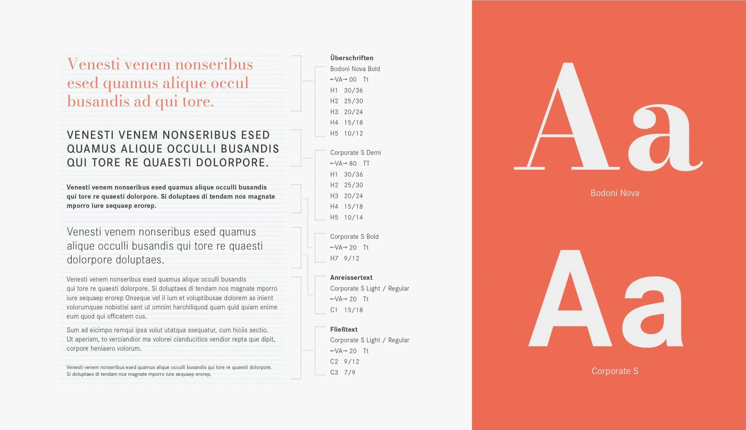
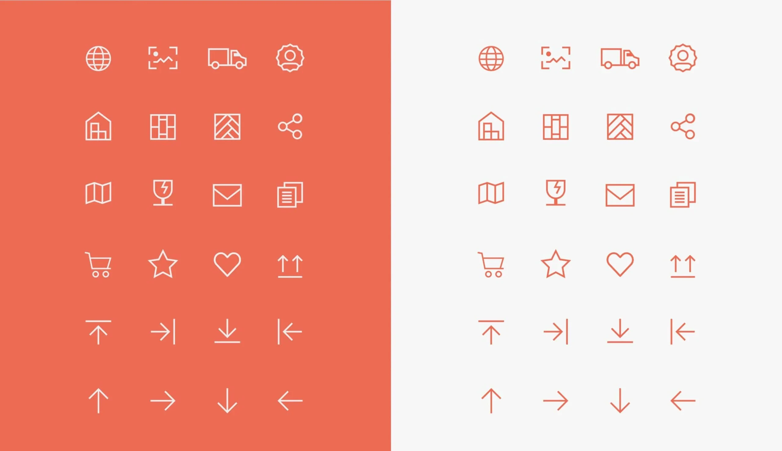
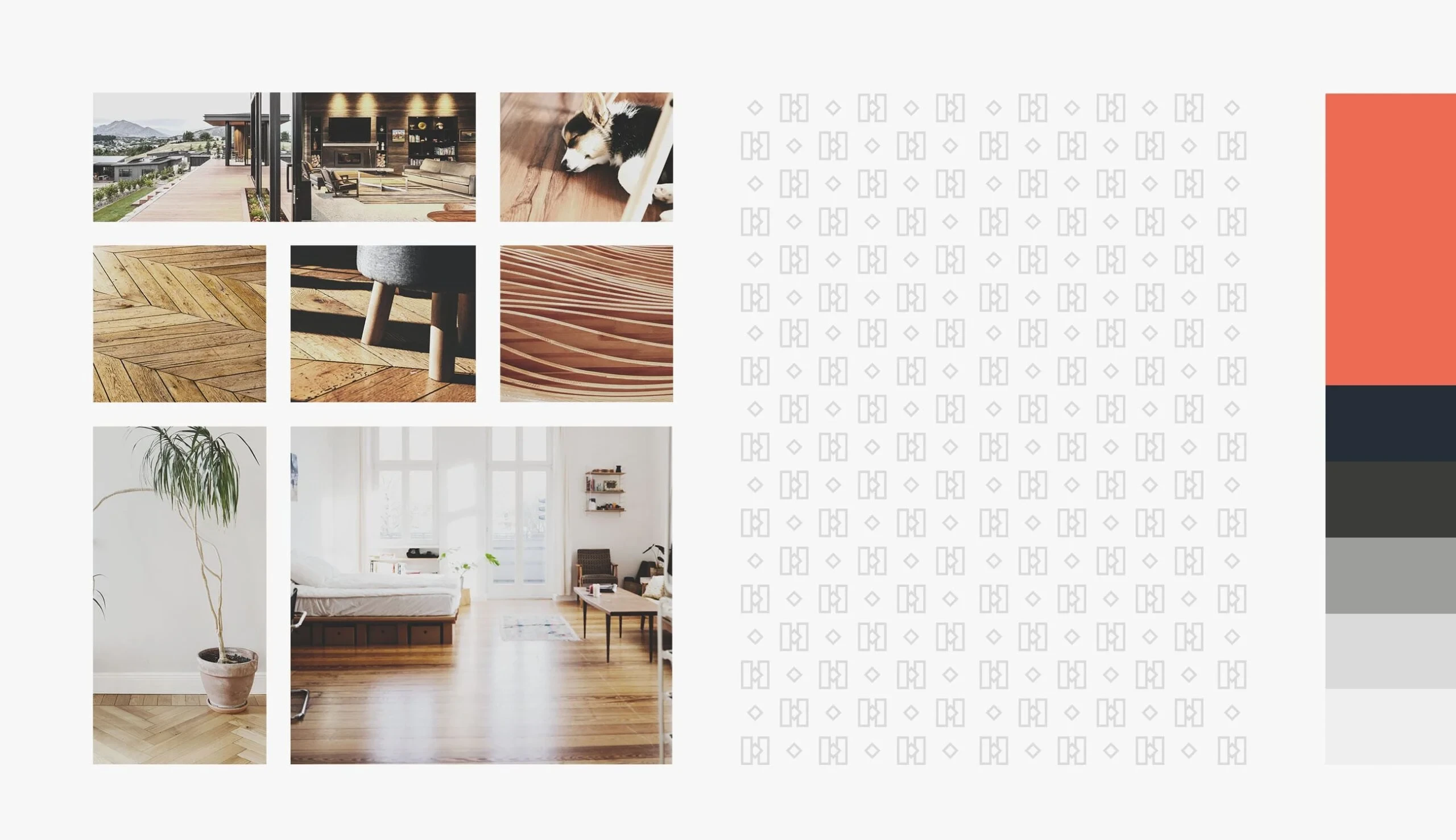
The colour palette built outward from the material world of parquet itself: warm coral as the brand accent, deep navy as the authority anchor, and a range of natural neutrals that give the system room to breathe. Bodoni Nova headlines bring the editorial weight of premium publishing; Corporate S provides the structural clarity the retail context demands.
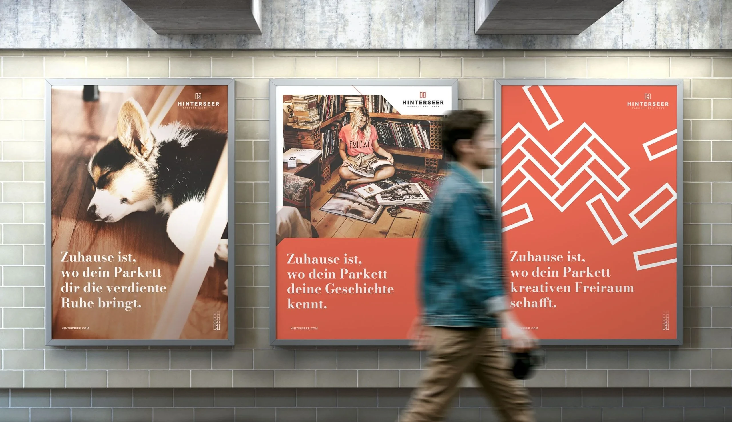
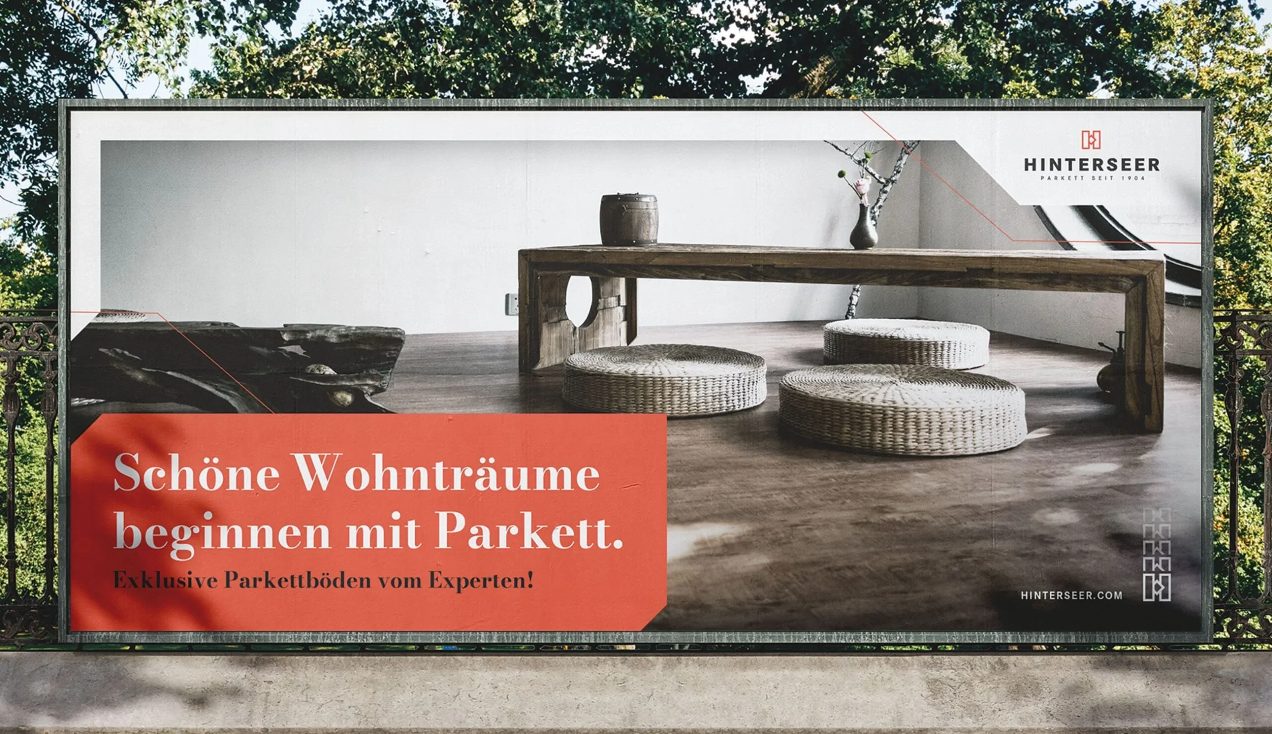
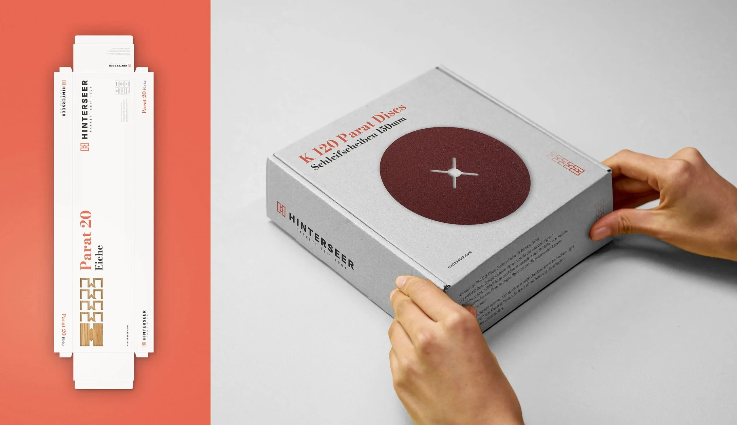
The campaign work — city lights, billboards, the image catalogue — positions Hinterseer not just as a flooring retailer, but as a brand with genuine lifestyle authority. The packaging brings the same rigour to the product experience.
Our Services
- Logo Relaunch: A new H monogram that connects 120 years of craft heritage to contemporary premium positioning — recognisable and evolved
- Corporate Design: Complete design system covering typography, colour, photography direction, pattern, and icon language
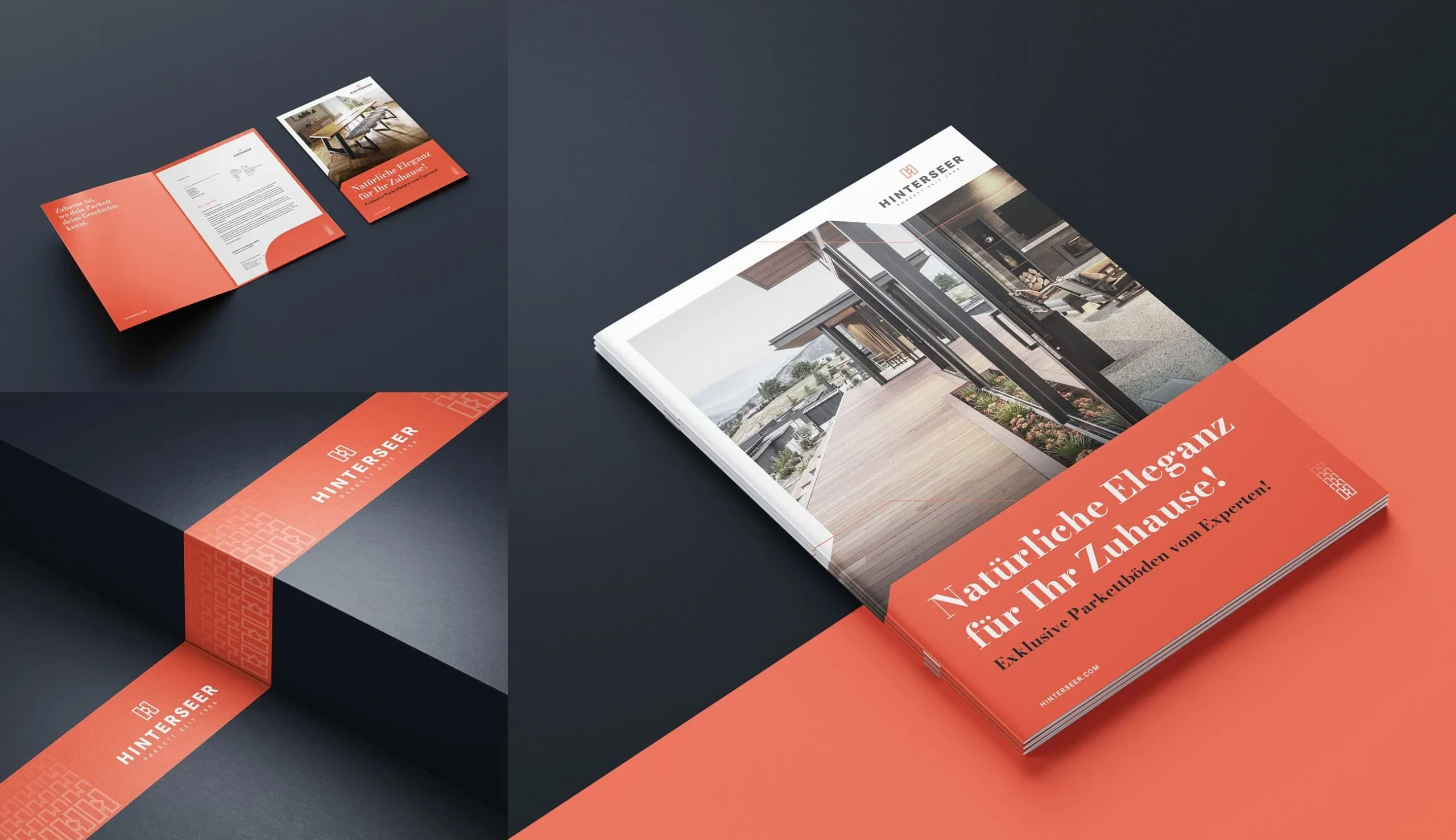
- Print Design: Full redesign of business stationery, brochures, and campaign materials, executed at premium production standard
- Packaging Design: Product box designs that make the brand tangible from the first point of physical contact
- Editorial Design: Large-format image catalogue and presentation materials that position parquet as a genuine design choice
Result
A brand transformation that earned the German Design Award — and more importantly, one that positions Hinterseer where it belongs: at the top of the German premium flooring market.
The new identity holds across 28 locations, scales from outdoor billboard to product label, and gives the business a visual foundation that will serve it for the next 120 years as confidently as the last. Tradition and ambition, resolved.