Automotive Markets: Corporate Branding
All Projects

Automotive Markets: Corporate Branding

Automotive Markets

Industry
Automotive
Services
Branding · Corporate Design

About the Client

Automotive Markets is a company operating in the automotive industry, providing market intelligence, consulting, or dealership services to businesses in the automotive sector. The company needed a professional visual identity system that communicates precision, dynamism, and the trustworthiness central to high-stakes automotive business.

TL;DR Results

Bold, geometric brand mark that communicates precision and momentum — instantly recognisable in the automotive context

Versatile logo system working from smartphone screen to presentation folder to branded merchandise

Complete stationery suite with consistent brand application across all business communication

Corporate design system providing the rules and assets for coherent long-term brand management

Challenge

The automotive sector has a visual language all its own — geometric precision, minimal decoration, and a sense of forward motion that communicates performance without screaming it. Getting that register right requires understanding both the industry's conventions and the specific point where this brand needs to differ from its competitors.

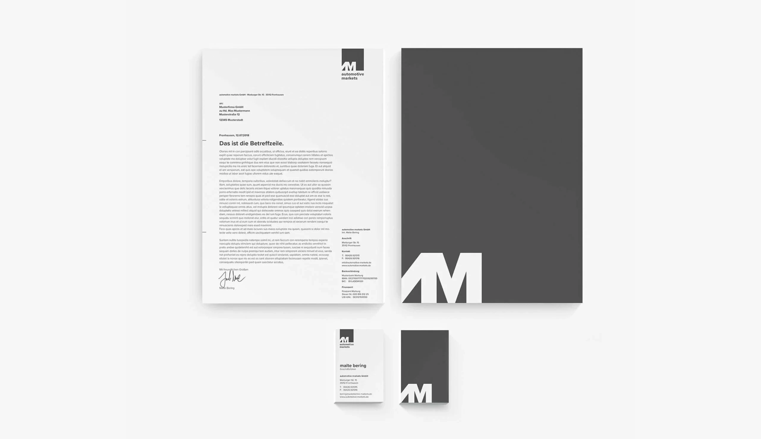
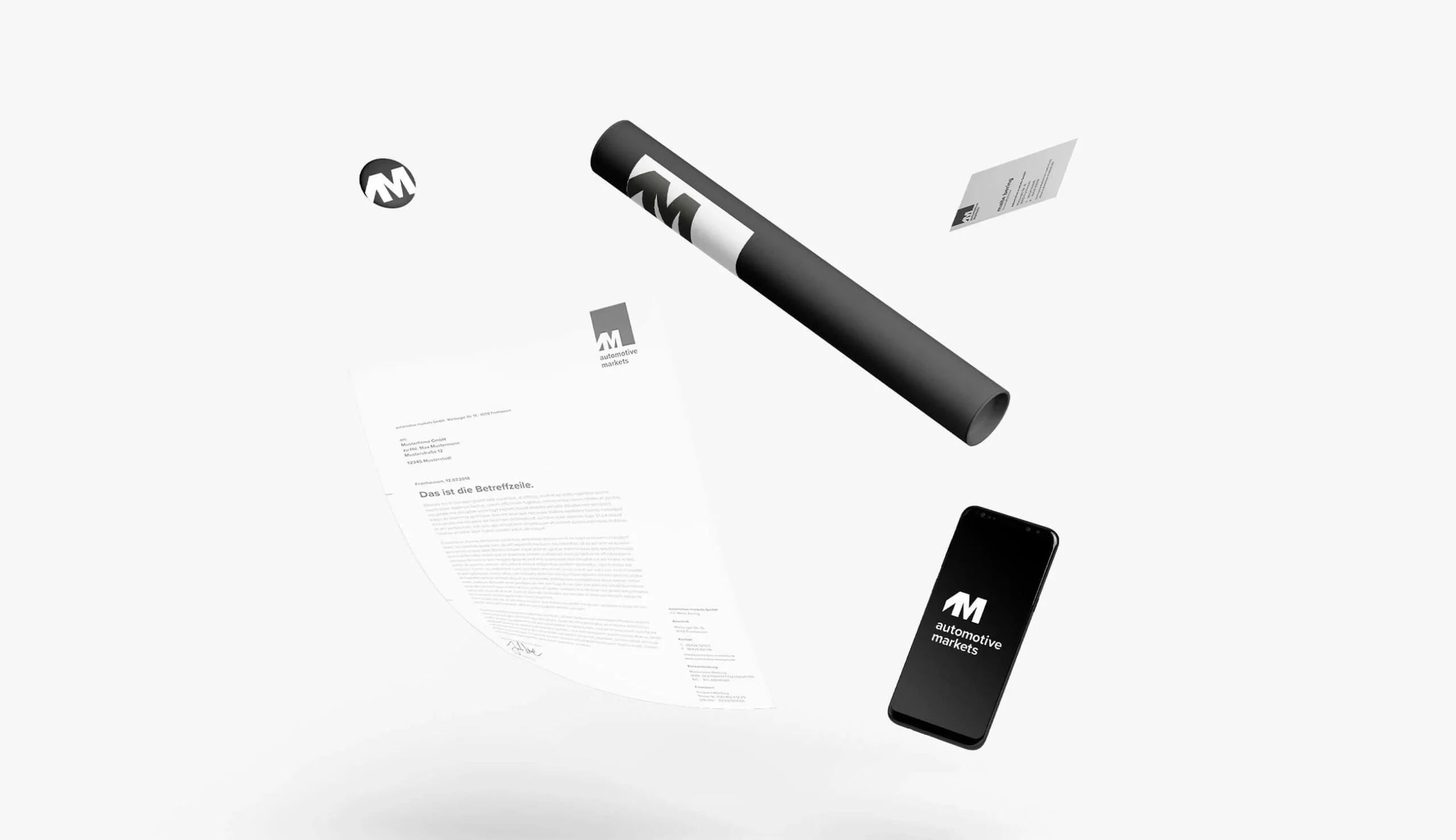
The identity also had to be genuinely flexible: working at the small scale of a business card icon, the medium scale of a letterhead, and the large scale of signage or vehicle graphics — all without losing coherence or impact.

Solution

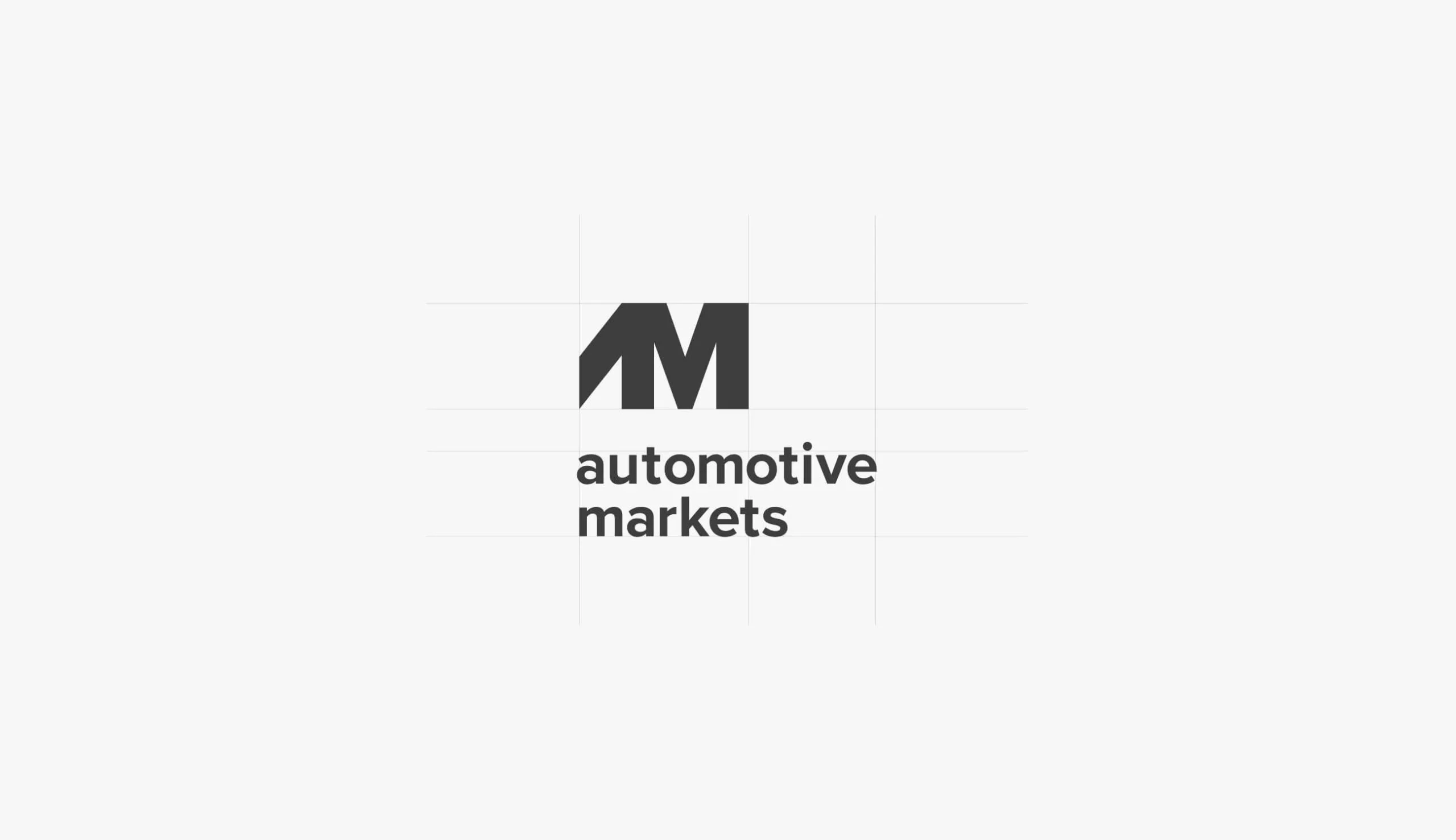
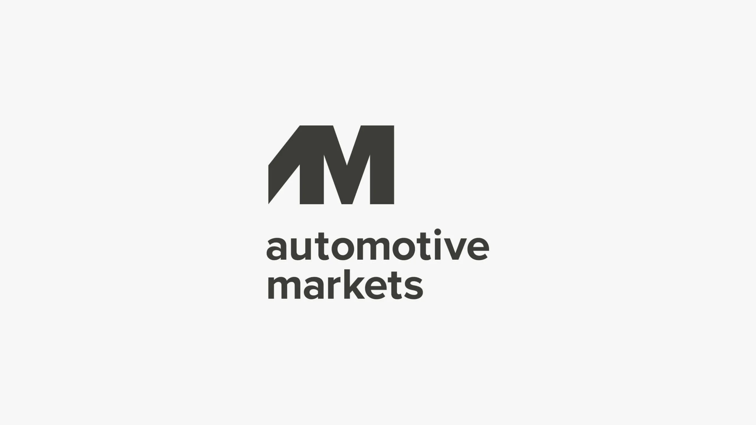
The AM monogram is the core of the identity — a geometric mark that fuses the letters A and M into a single, precisely constructed form. The angular peak of the A creates a forward-pointing diagonal that gives the mark direction and energy; the M grounds it with stability and solidity. The result reads immediately as a professional, automotive-sector mark without borrowing from the generic visual vocabulary of the industry.

The palette is executed in near-black with white — no colour needed. The geometry and the proportions do the work. The wordmark in clean sans-serif reinforces the brand's contemporary positioning, and the stationery suite deploys the identity with consistent confidence across every standard business touchpoint.

Our Services

  • Logo Design: A geometric AM monogram built for the automotive sector — precise, directional, and versatile from icon to large format
  • Corporate Design: Complete visual identity system with typography, colour, and layout guidelines for consistent brand application
  • Brand System: Design assets and application rules enabling the brand to be used consistently across all contexts

Result

A brand identity that positions Automotive Markets with the authority the sector demands — precise, bold, and built to last. The AM mark works wherever the business needs it to, and the complete stationery system ensures every communication reflects the brand's standards.

Automotive Markets: Corporate Branding screenshot 1
Logo — geometric AM monogram combining an angular A-peak with an M form, paired with 'automotive markets' wordmark in dark grey
Automotive Markets: Corporate Branding screenshot 2
Logo construction — AM mark with proportional grid showing spacing and alignment relationships
Automotive Markets: Corporate Branding screenshot 3
Stationery — letterhead, dark grey presentation folder, and business card as a flat-lay suite
Automotive Markets: Corporate Branding screenshot 4
Brand applications — floating brand collateral: AM icon, branded tube, letterhead, business card, and smartphone lockscreen

Let's build something remarkable.

You have a vision. We have the team to make it real.
Tell us what you're building — we'll tell you exactly how to make it exceptional.

Most inquiries get a personal reply quickly.

Free first consultation · No commitment · Award-winning team

Why serious companies choose us.

15 years. 100+ projects. Award-winning work.

The people who pitch are the people who build.

No layers, no handoffs, no revolving door of faces. The developers and designers you meet at the start are the same ones shipping your product at the end.

We've been the client too.

We build our own software products. We know the frustration of missed deadlines and vague updates — so we built our process to be the agency we always wished existed.

15 years of pattern recognition.

We know which technologies age well, which don't, and which were just hype. That judgment — earned the hard way — protects your budget and your roadmap.

You'll always know where things stand.

Weekly updates, clear milestones, no surprises. If something changes, you hear it from us first — not when the deadline passes.

Your code. Your freedom.

No proprietary systems, no lock-in. We build on open source and hand over full ownership. Change agencies tomorrow if you want. (You won't want to.)

Good enough is not in our vocabulary.

Internal reviews, design critiques, QA loops — before anything reaches you. We only ship things we're proud to put our name on.