
Challenge
The challenge was to design an identity that could hold two things simultaneously: the scientific credibility a practice needs to be trusted by senior executives, and the warmth and approachability that makes people actually reach out.
Most psychology practices err heavily in one direction — either clinical and cold, or soft and unstructured. This brief demanded both. The name is playful; the service is serious. The identity had to bridge that gap without compromise.
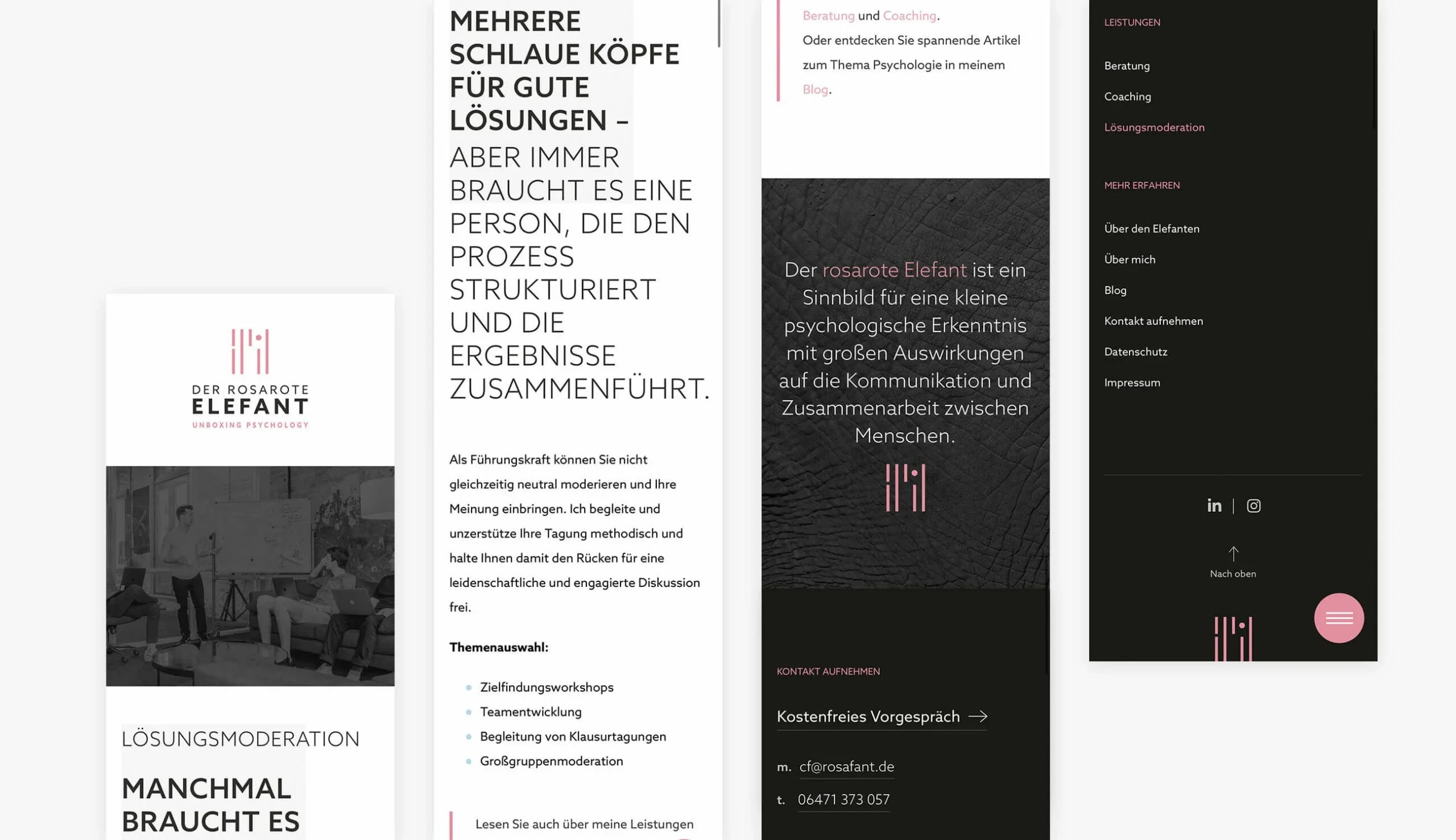
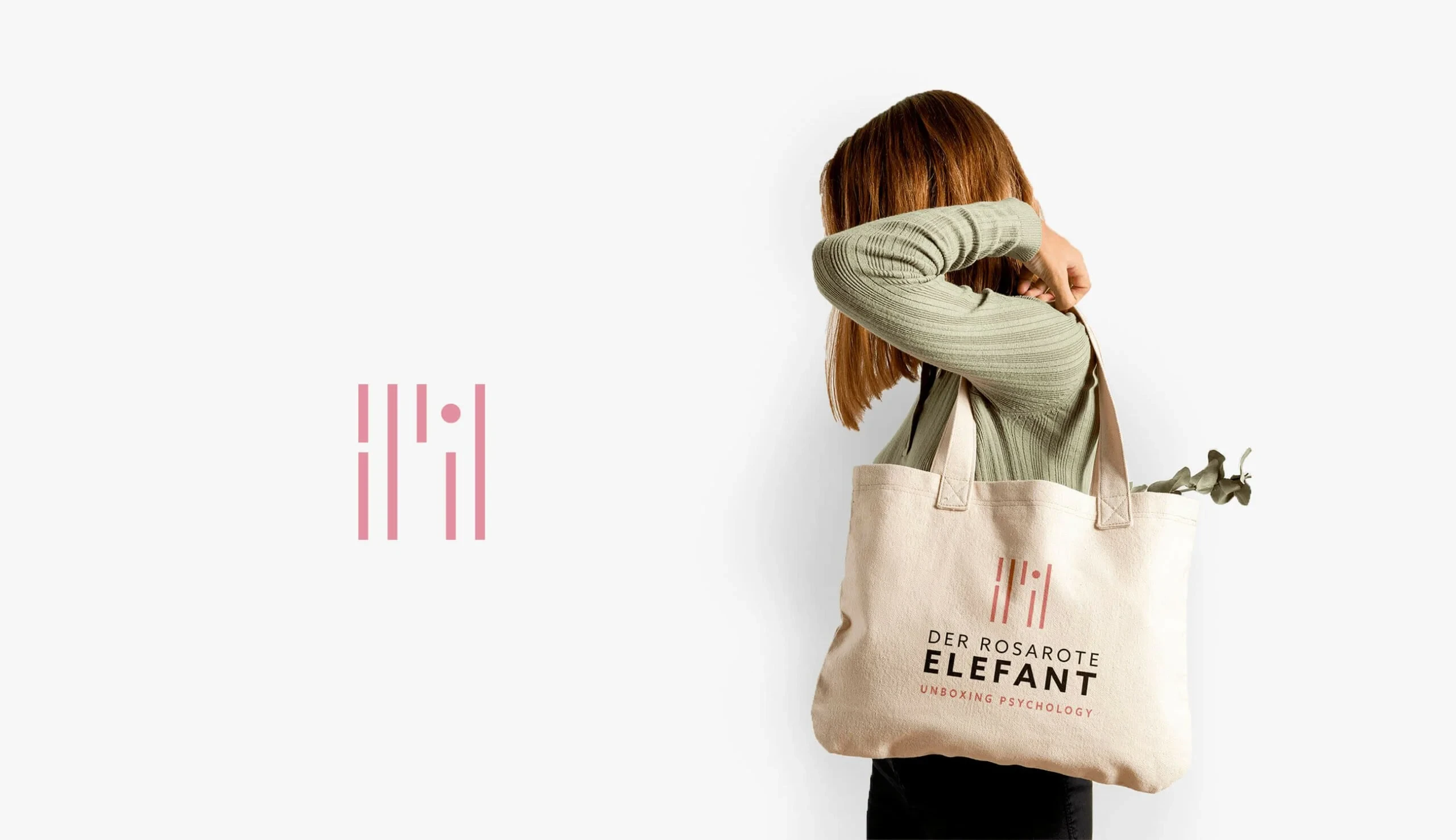
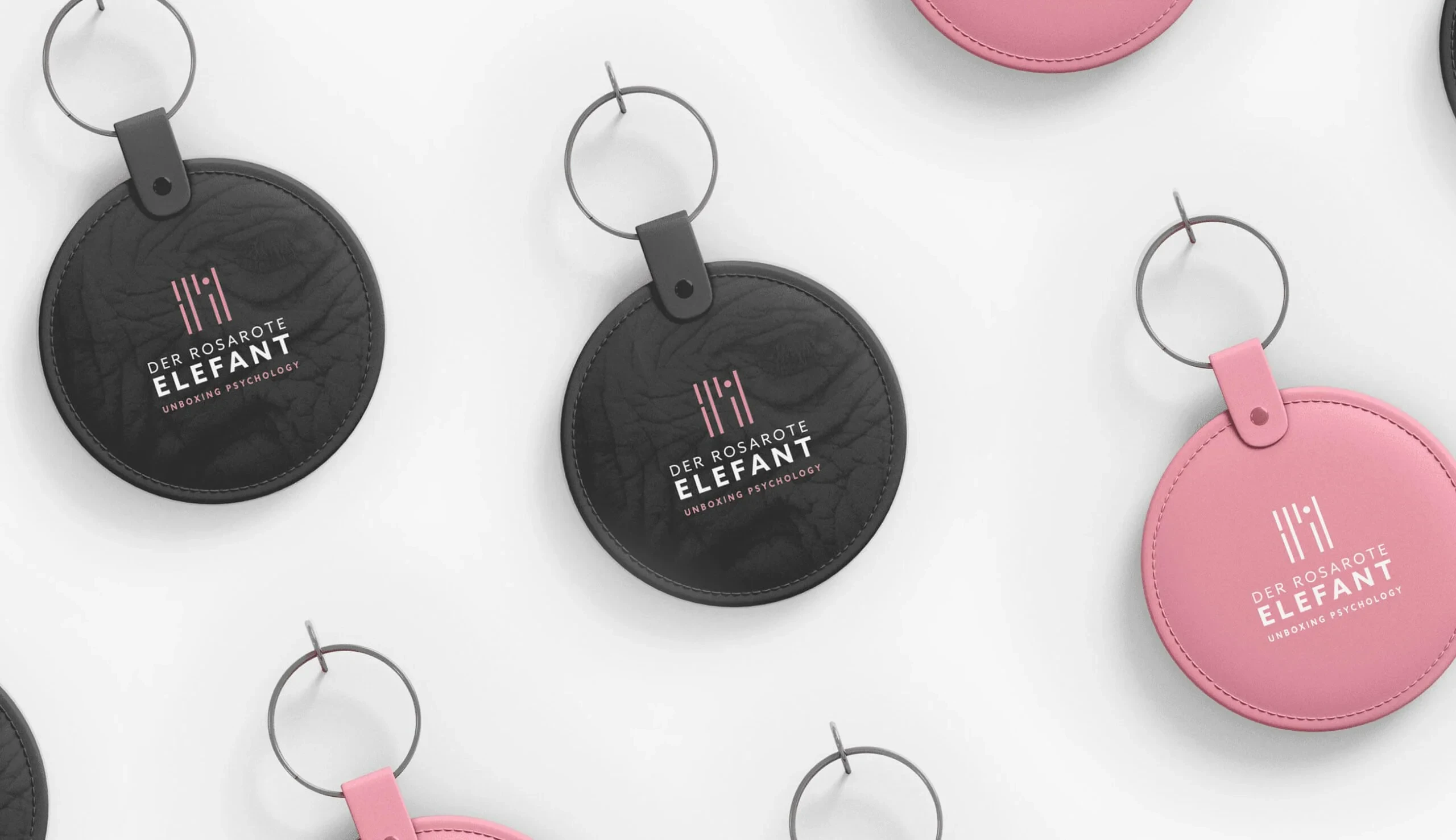
The visual system also needed to work across an unusually wide application range — from a formal business letterhead to a leather keychain — without losing coherence.
Solution
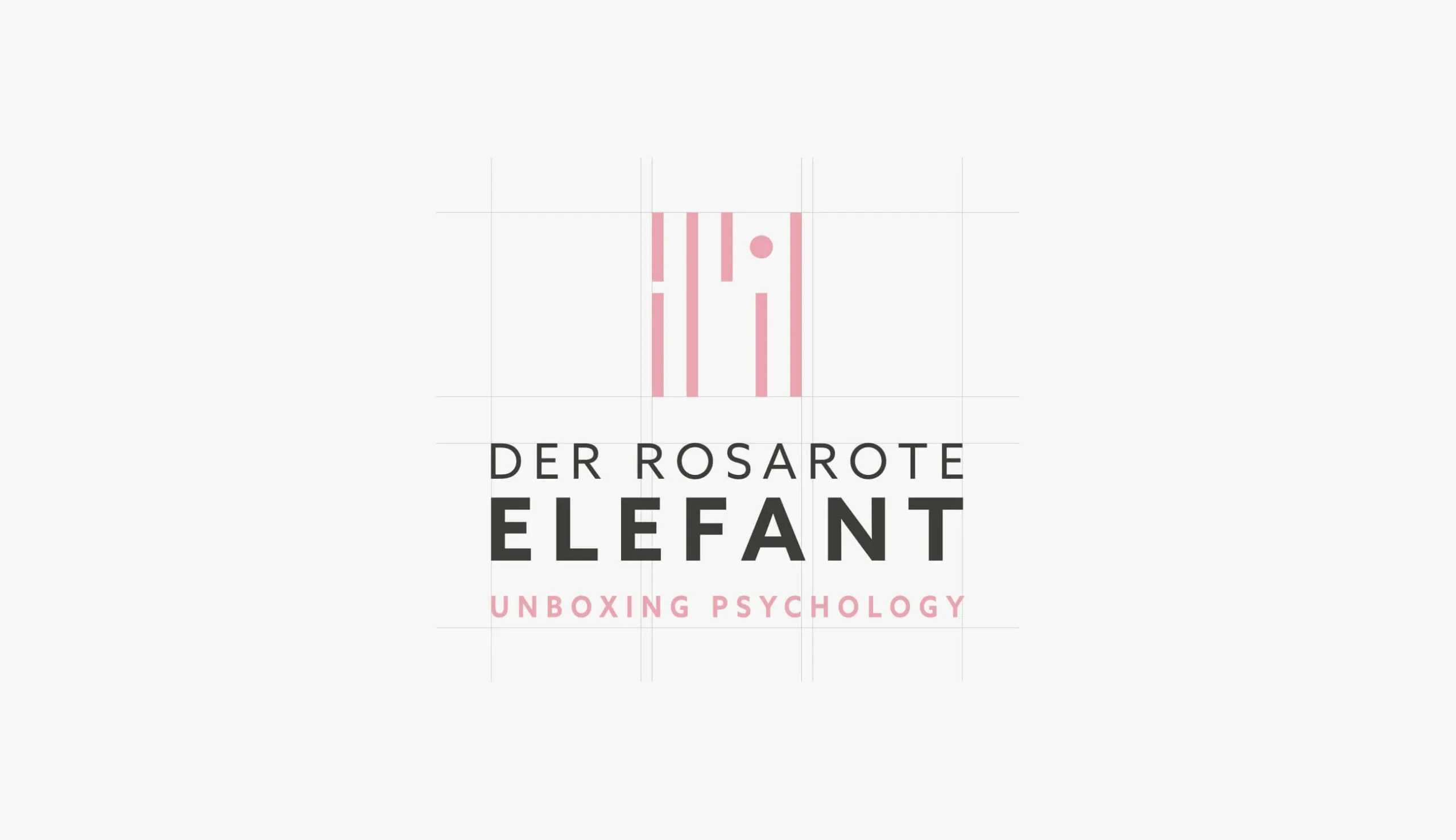
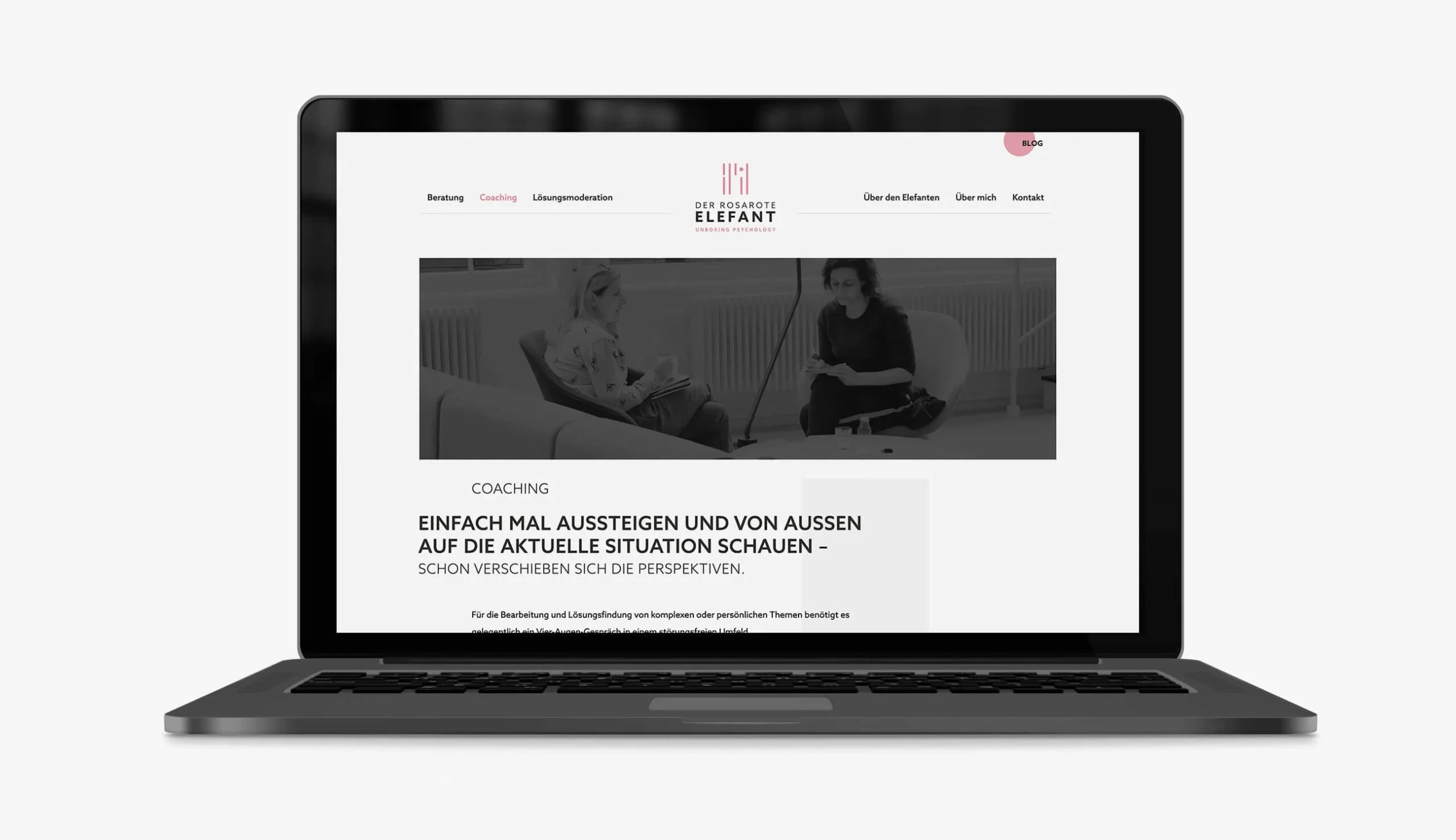
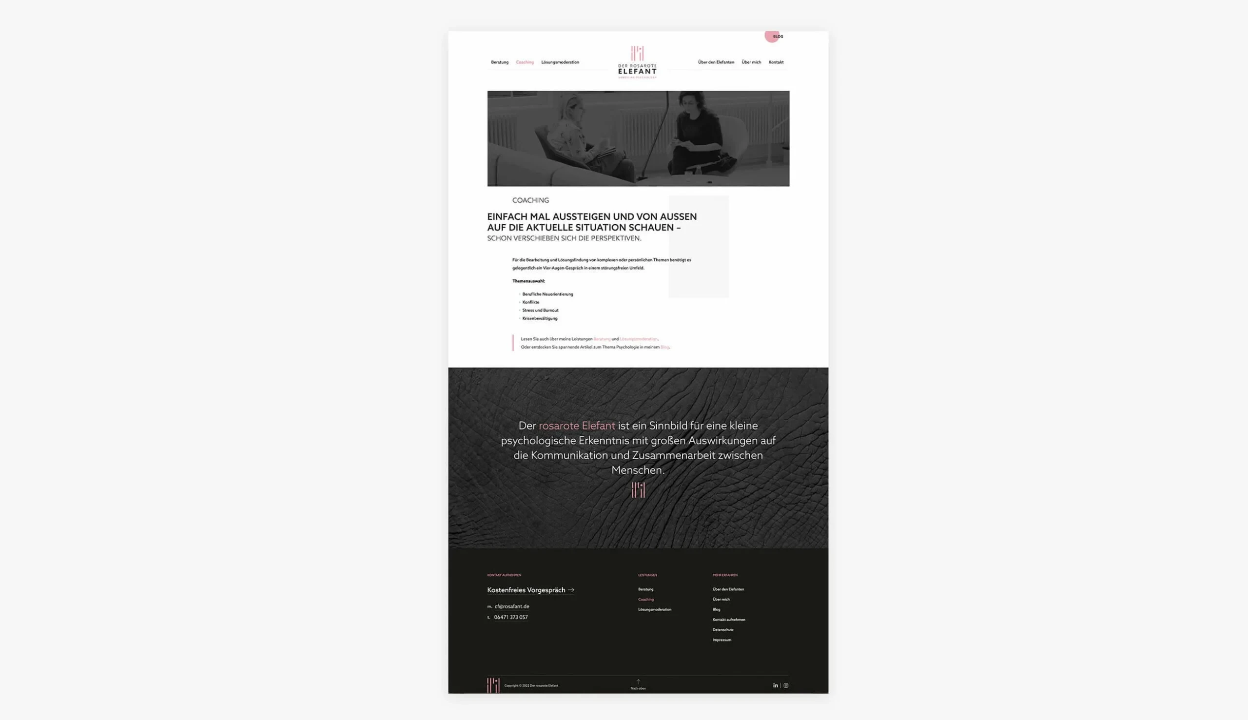
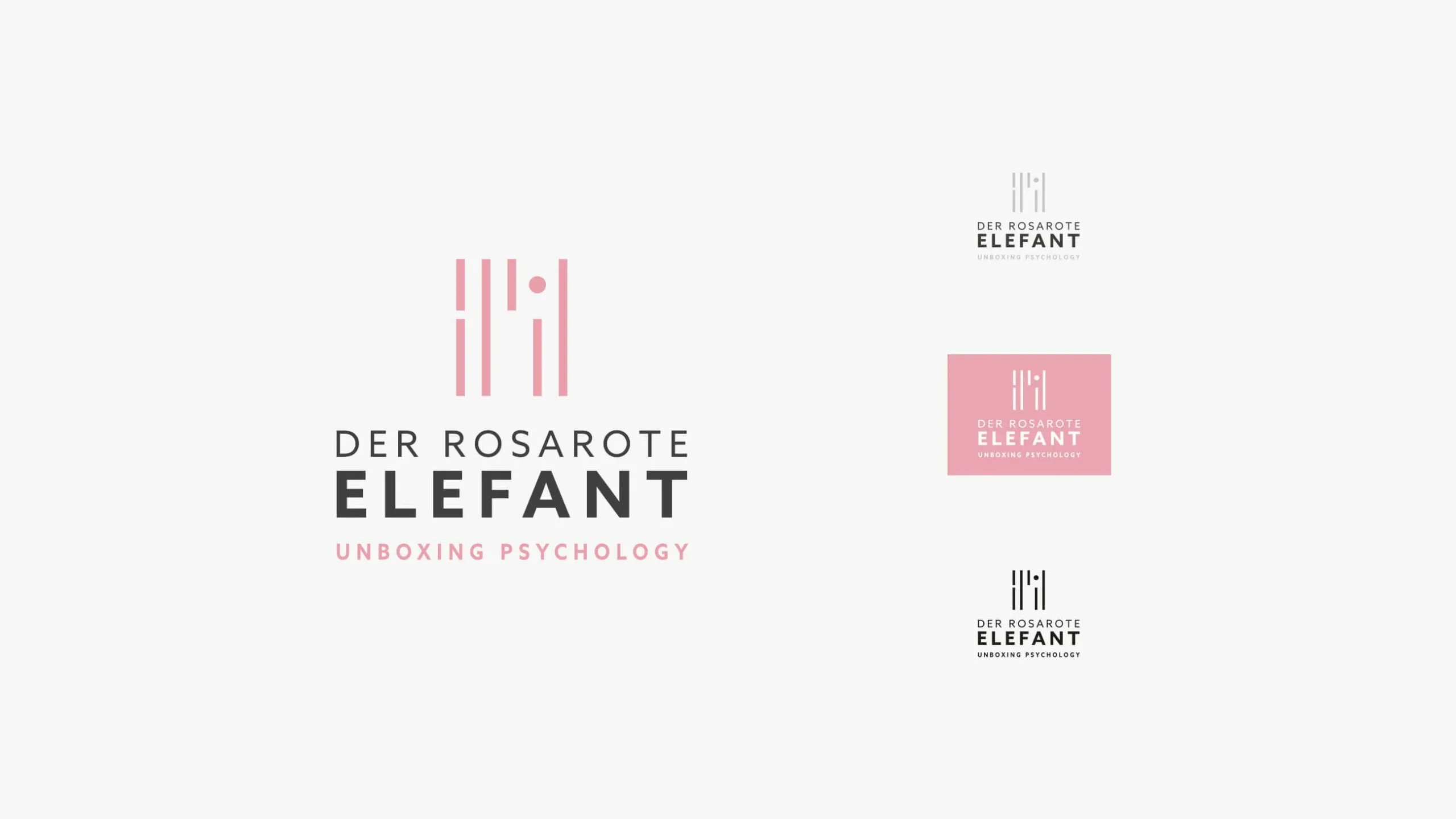
We built the identity around an abstract icon mark constructed from vertical bars — a form that reads simultaneously as a stylised figure, a row of people, and a bar chart. It's geometric and precise, but it has warmth. The pink draws from the brand name directly, used with restraint so it feels intentional rather than decorative.
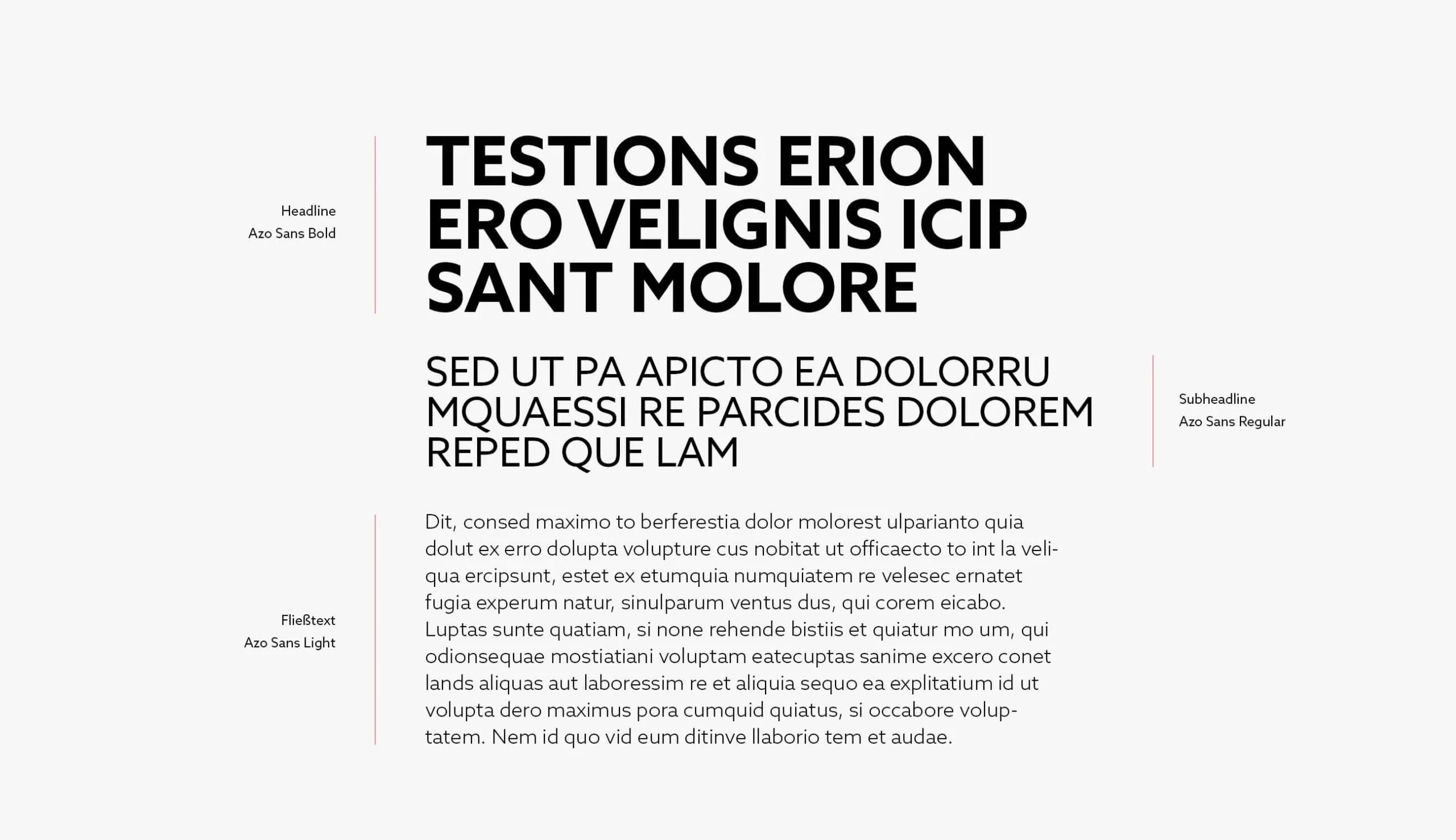
The typography is set in Azo Sans throughout — a typeface with a quiet authority and contemporary humanist character that gives the brand the right register across all contexts.
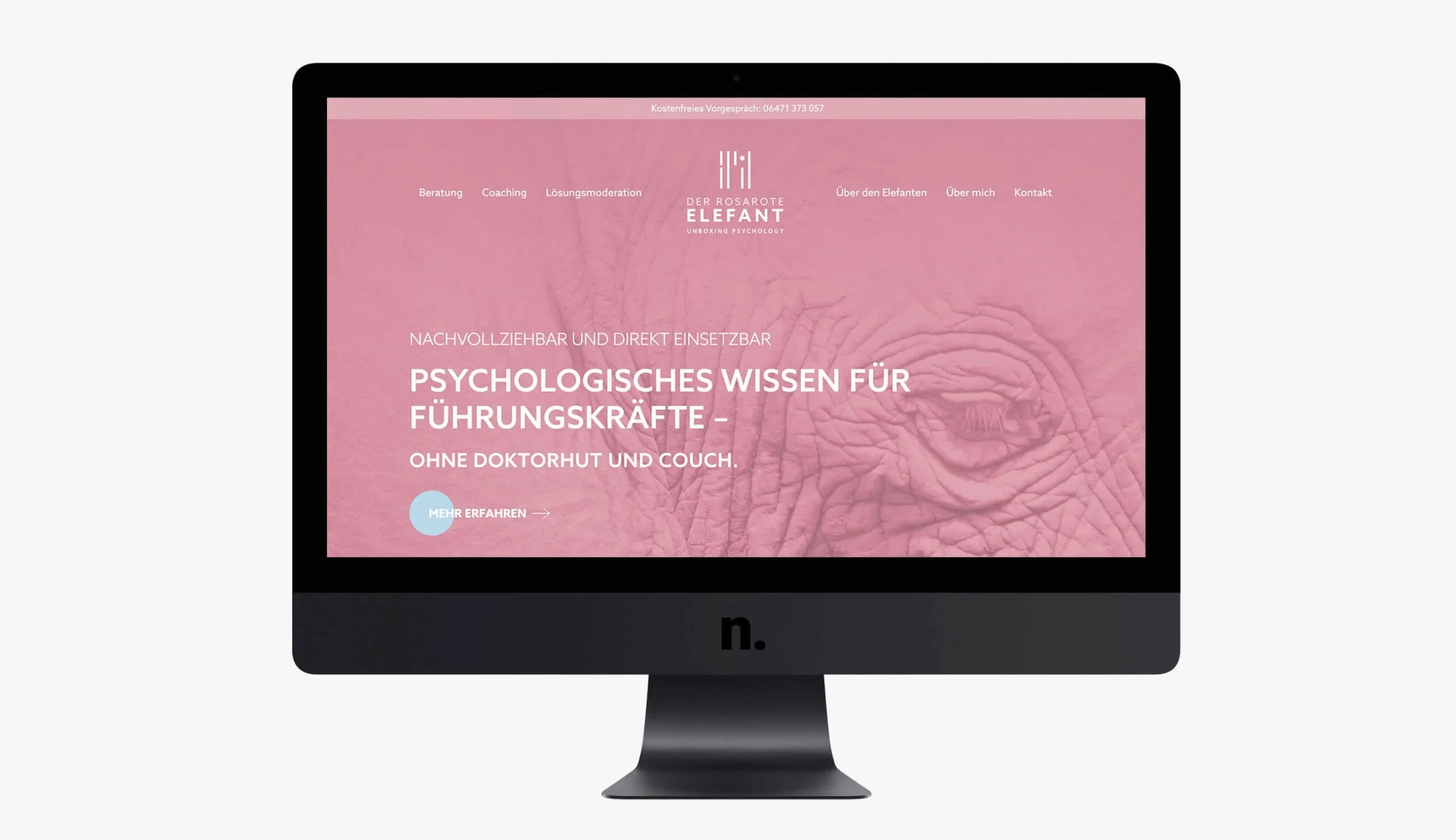
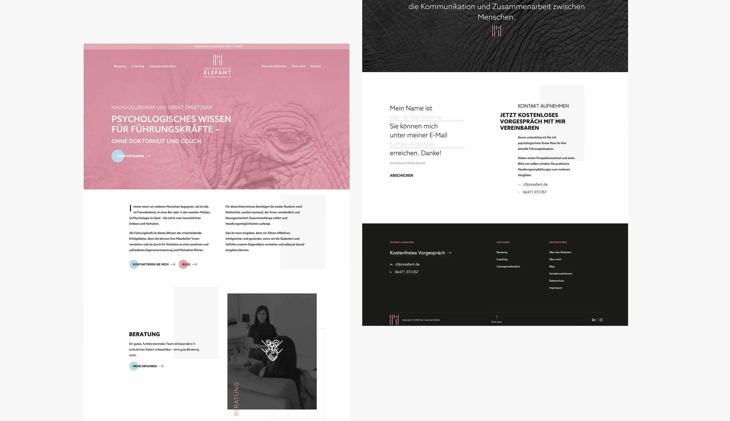
The website was designed to speak directly to its audience: senior leaders who are time-poor, sceptical of jargon, and need to immediately understand what they're getting and why it matters. The hero is confident and direct. The service pages are clear and structured. The contact path is short.
Our Services
- Corporate Design: Complete visual identity system anchored in the brand's psychological positioning — rigorous without being cold
- Logo Design: A distinctive geometric mark that works from business card to leather emboss, communicating both precision and humanity
- Webdesign: A site structured around the client's decision journey — from first impression to appointment booking in as few steps as possible
- UI/UX Design: Interface design that prioritises clarity and confidence, removing every barrier between visitor and contact
Result
A brand identity that earns its German Design Award Special Mention — not because it follows design conventions, but because it solves a genuinely difficult communication challenge with intelligence and precision.
Der rosarote Elefant now has an identity as memorable as its name, and a website that converts professional curiosity into client conversations. The system scales from digital presence to physical merchandise without losing its voice.