Challenge
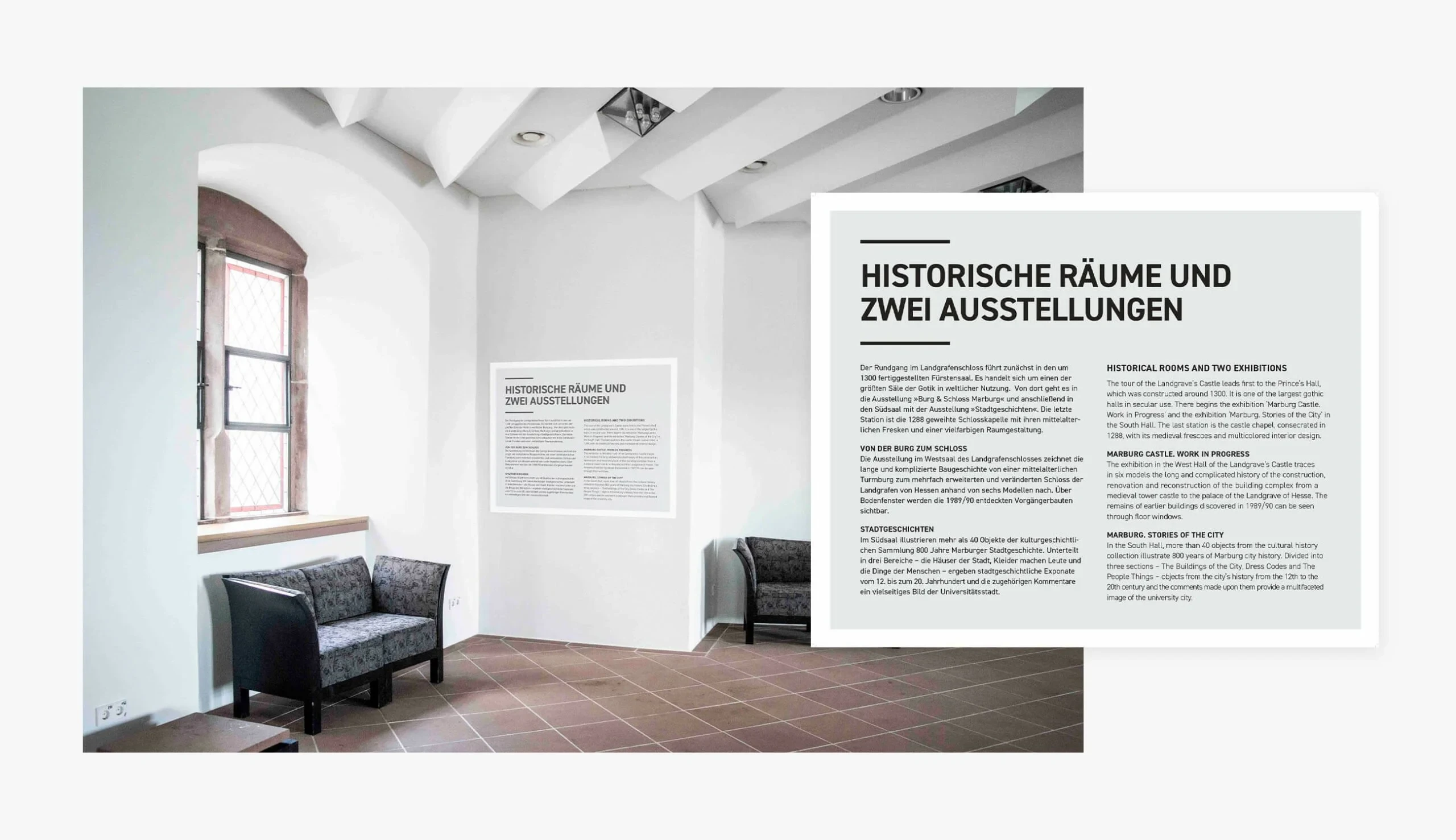
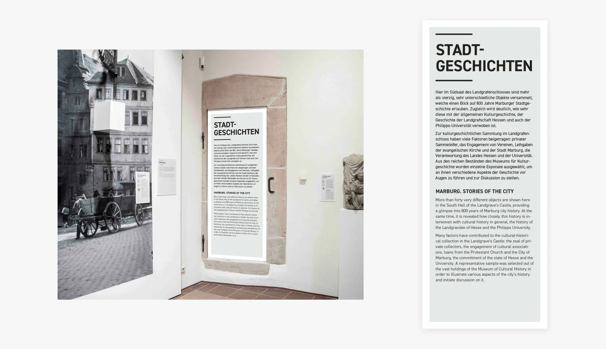
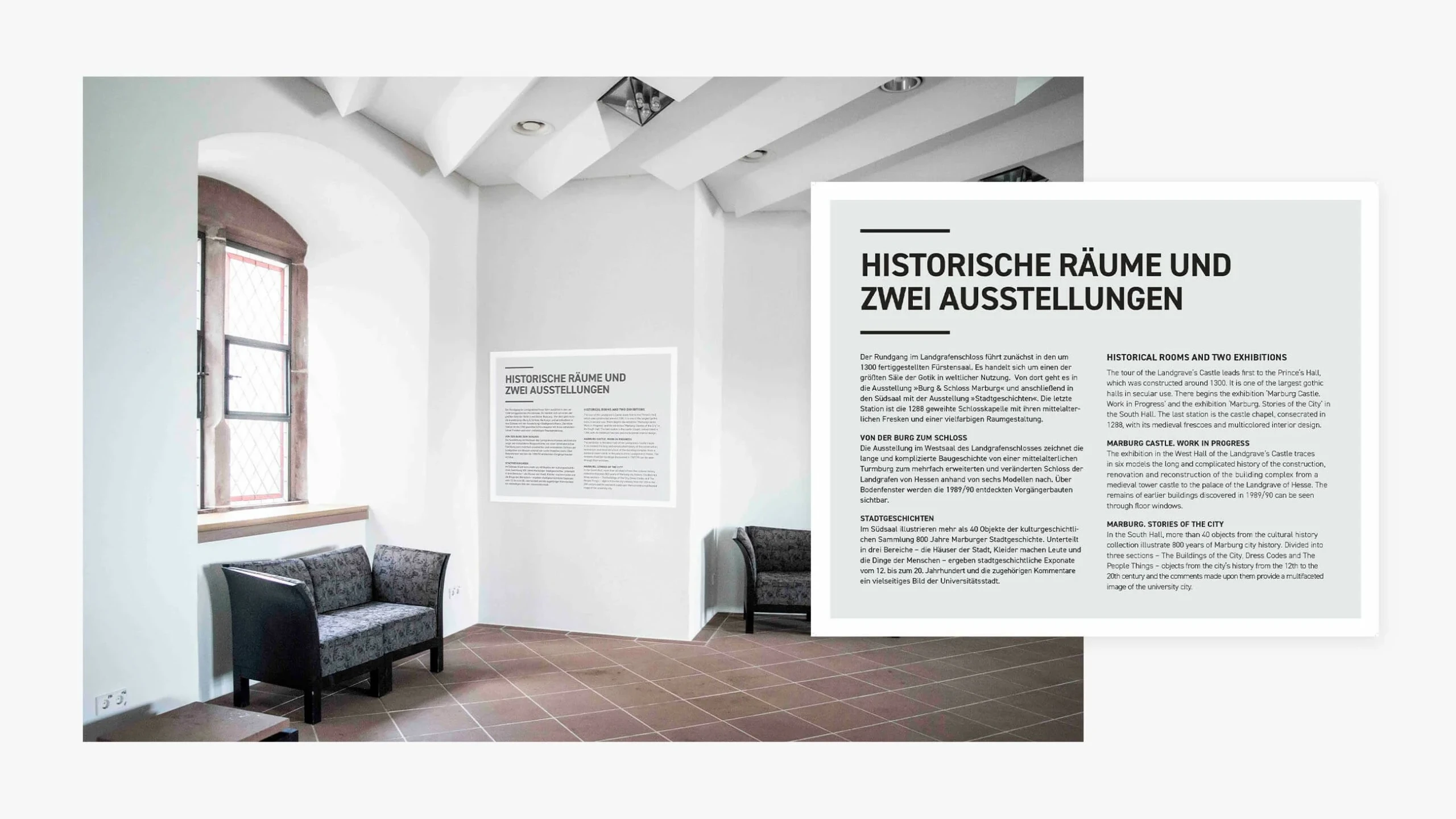
Exhibition design inside a listed medieval building is as much about restraint as it is about communication. Every panel, label, and directional sign must earn its place. In a space of this quality, the wrong material choice, the wrong scale, or the wrong typographic tone can diminish the very thing you are trying to explain.
The brief demanded a system that was genuinely bilingual (German and English with full parity), accessible to visitors of all ages and language backgrounds, and capable of holding together across the castle's dramatically varied spaces — from grand vaulted halls to narrow Gothic corridors.
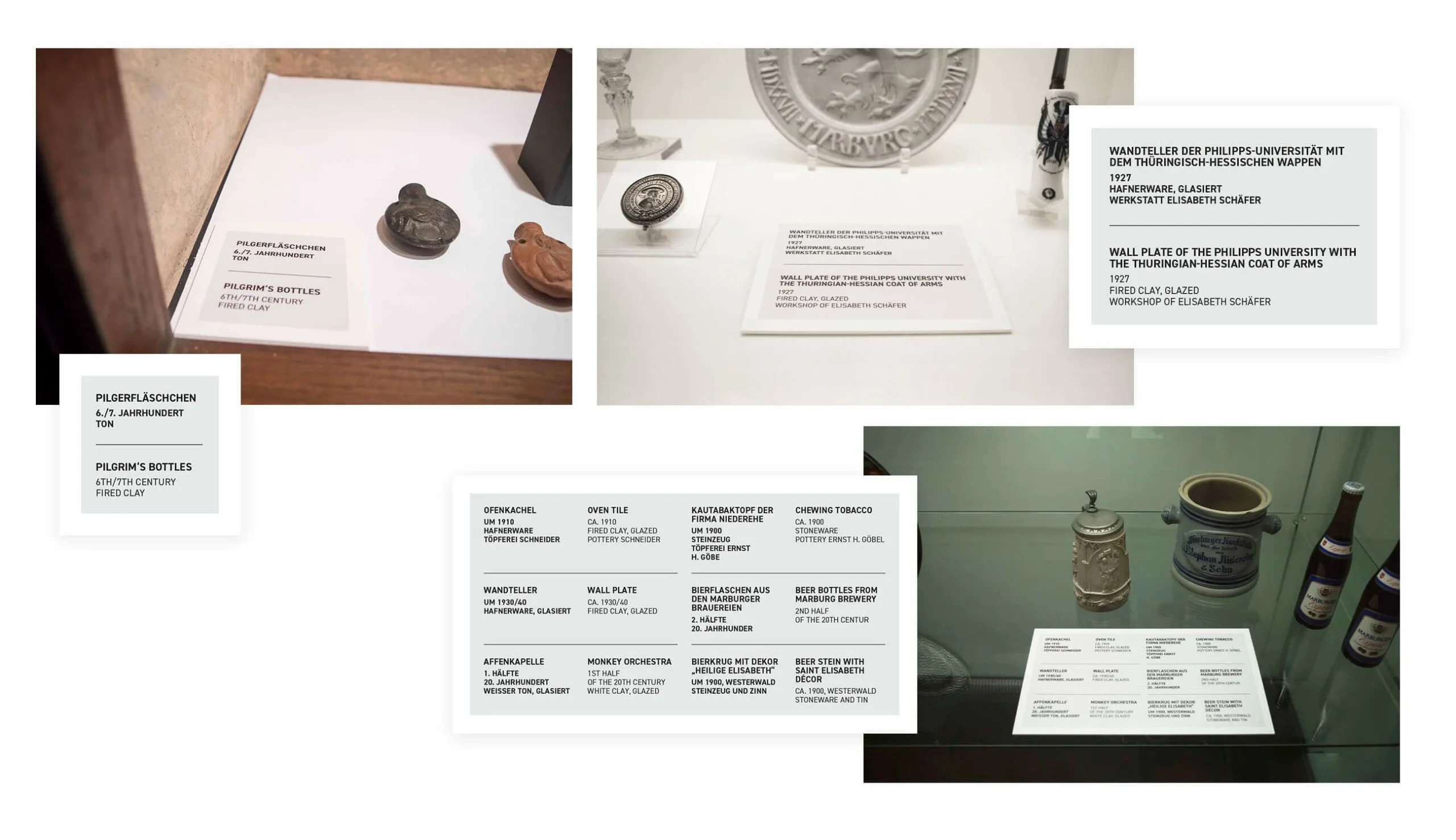
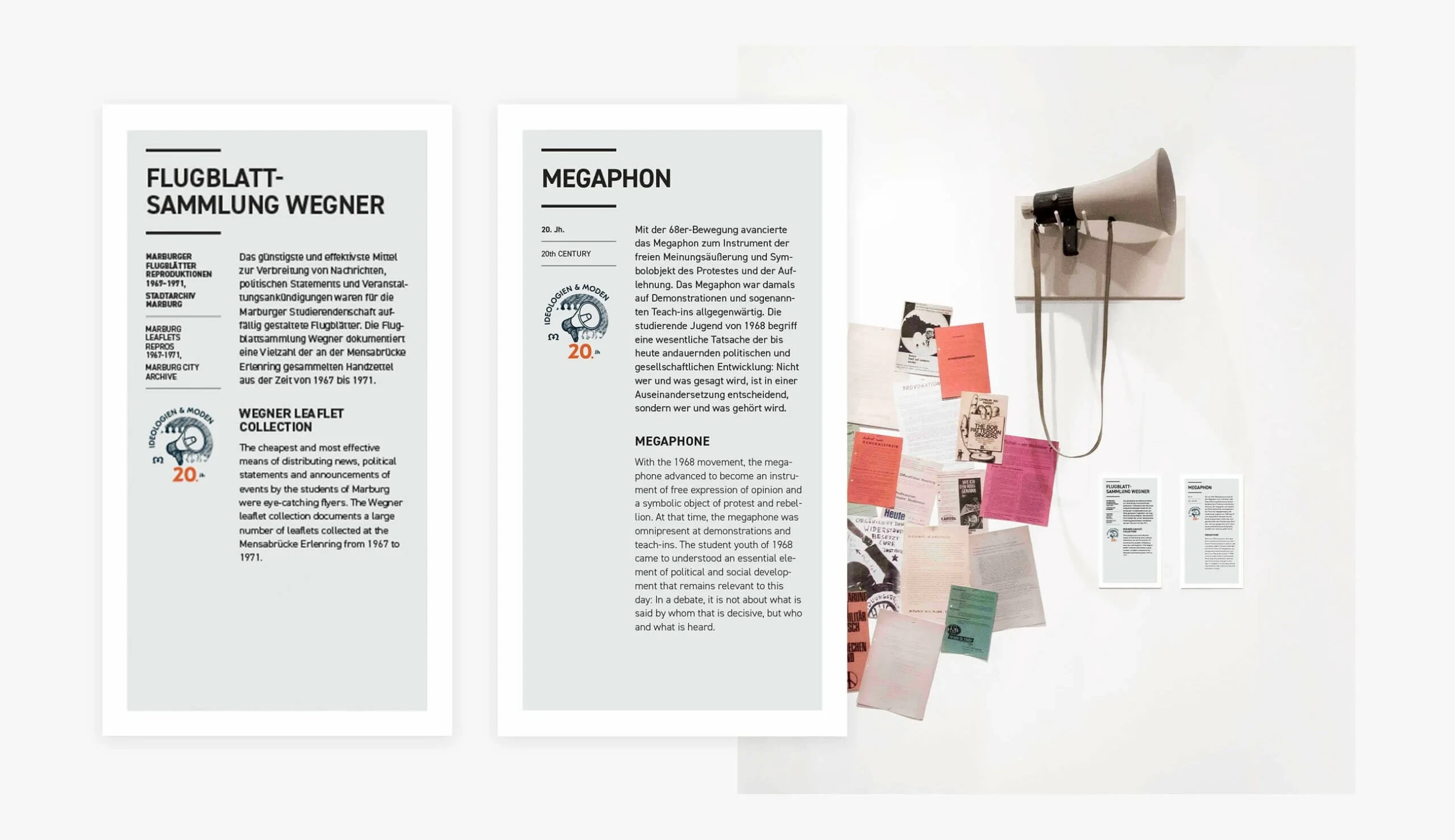
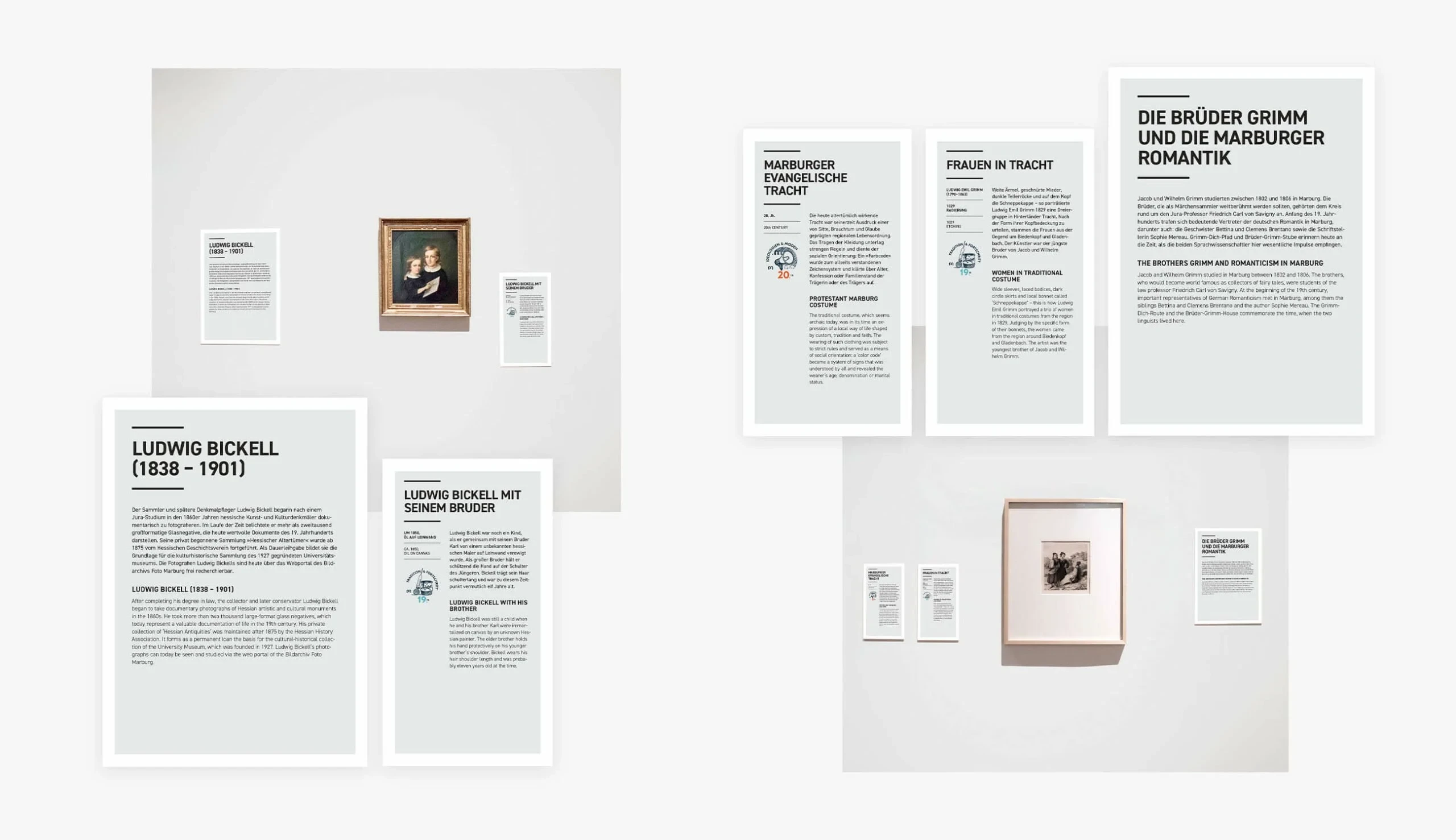
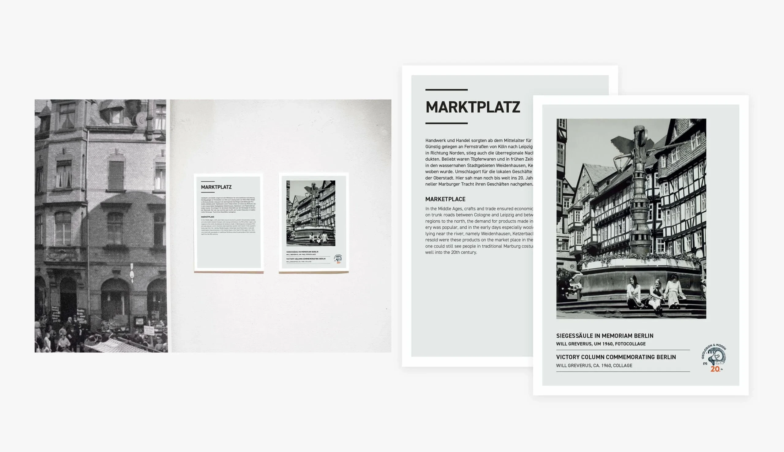
Object labels for a diverse collection of artefacts — medieval ceramics, historical documents, artworks, and curiosities — had to follow a consistent format while carrying widely varying amounts of information.
Solution
We designed a text-led system built on structural clarity and extreme typographic rigour. The hierarchy is unambiguous: exhibition title, section introduction, body text, and object caption each occupy a distinct visual register. The typeface choices — clean, contemporary, highly legible — read in the castle's ambient light without competing with the stonework or the artefacts.
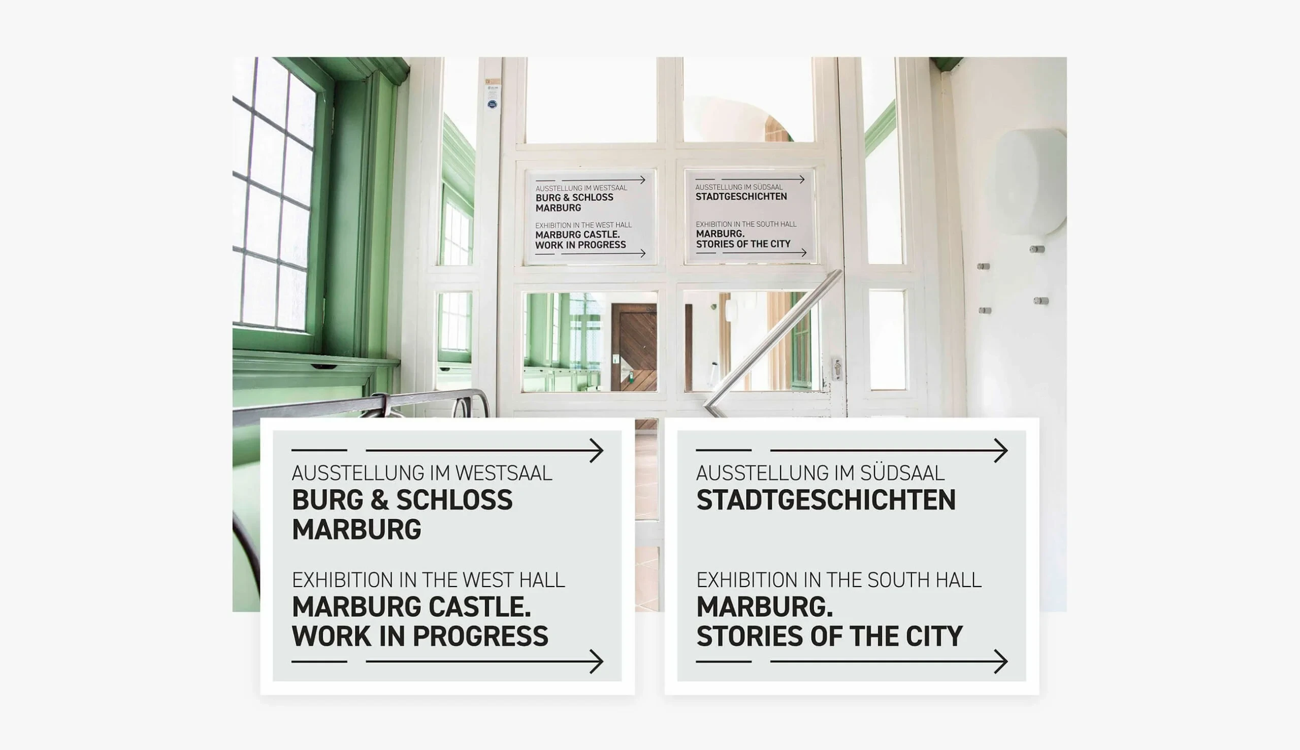
Every panel is bilingual throughout: German and English appear in a consistent parallel format, never as an afterthought. The wayfinding system reduces navigation to its simplest possible form, using directional arrows and exhibition names that visitors understand at a glance.
The palette is deliberate restraint: white, black, and the paper tones of the materials themselves. Colour is introduced only through historical imagery and original artefacts — never imposed by the design.
Our Services
- Exhibition Design: Text panels, section introductions, and conceptual communication for two complete permanent exhibitions
- Signage Design: Bilingual wayfinding that routes visitors through the castle's complex spatial sequence with absolute clarity
- Print Design: Artefact labels, supporting print materials, and exhibition take-away formats
Result
An exhibition communication system that has become invisible in the best sense — it serves the visitor without drawing attention to itself, and it lets the castle and its collection do the work.
The Landgrafenschloss now has a design language it can extend and maintain consistently across future exhibitions, new acquisitions, and changing displays. The system works because it never competes with what it is communicating.