Starting Point
Satzbrand is a Bremen-based PR agency that sets itself apart from conventional communications firms through craftsmanship and a sociologically trained perspective. Its previous visual identity did not reflect this positioning — there was no distinctive brand mark that conveyed the agency's analytical, reduced character.
The Task
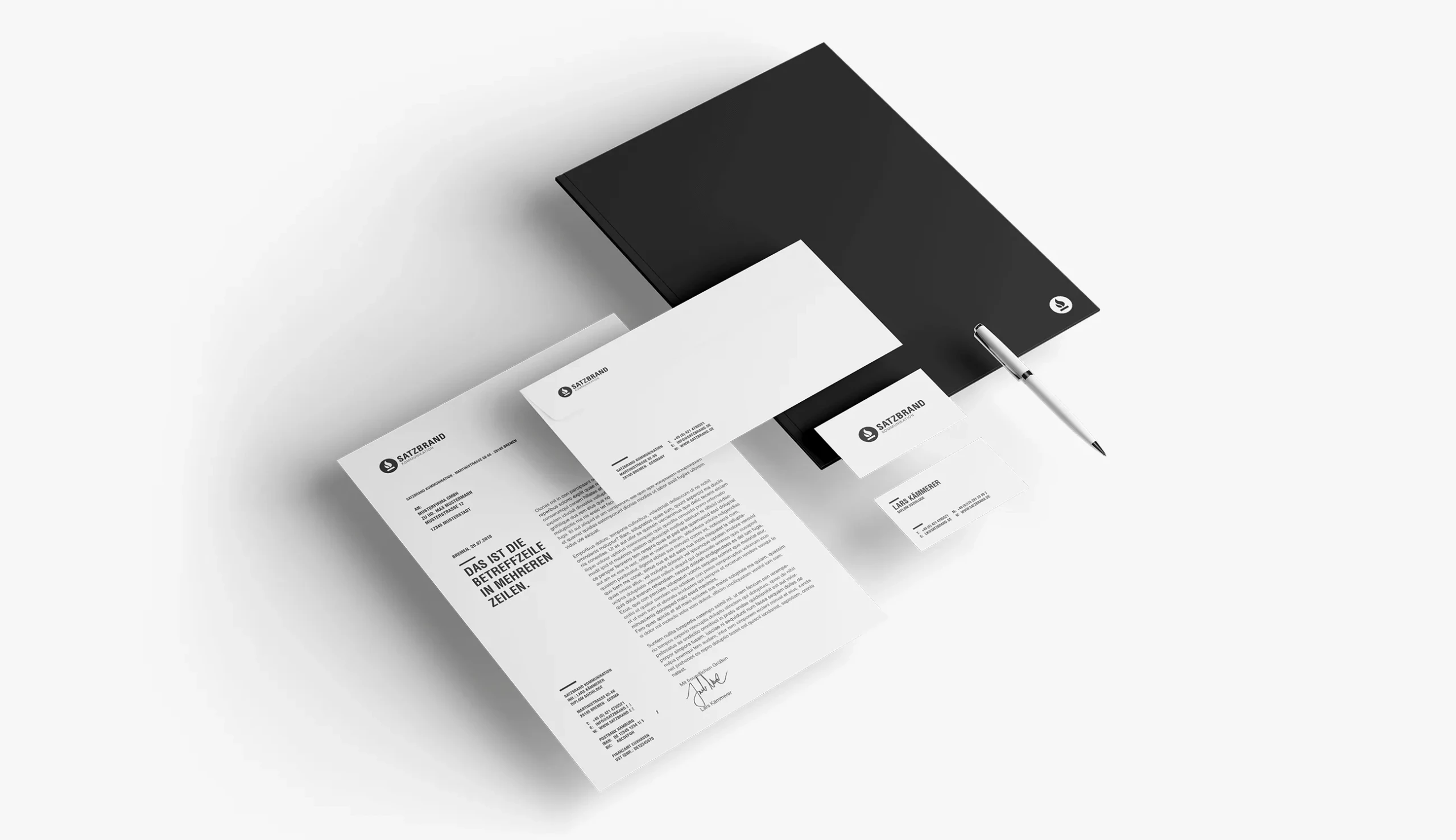
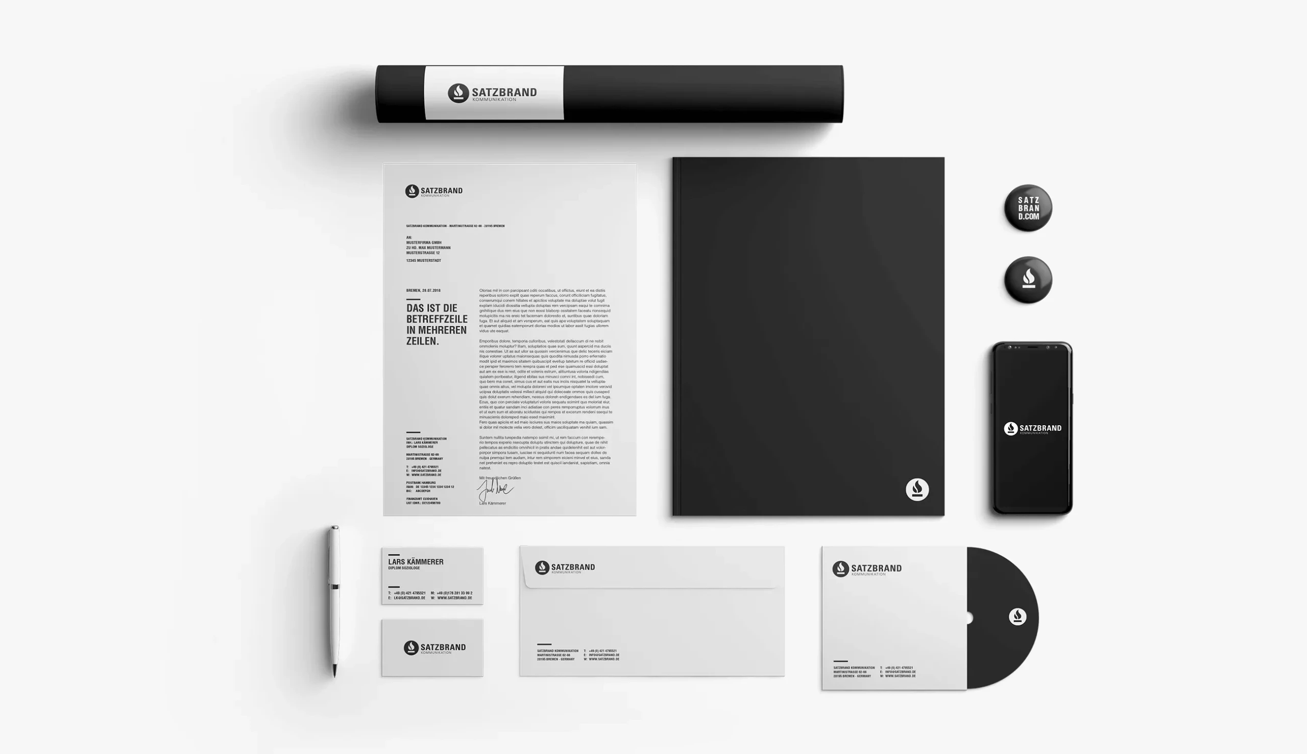
We developed a new corporate identity that translates the agency's ambition without compromise: restrained, typographically precise, and focused on the essential. At its heart sits a word-and-mark logo combining a distinctive circular symbol with a confident sans-serif wordmark.
Execution
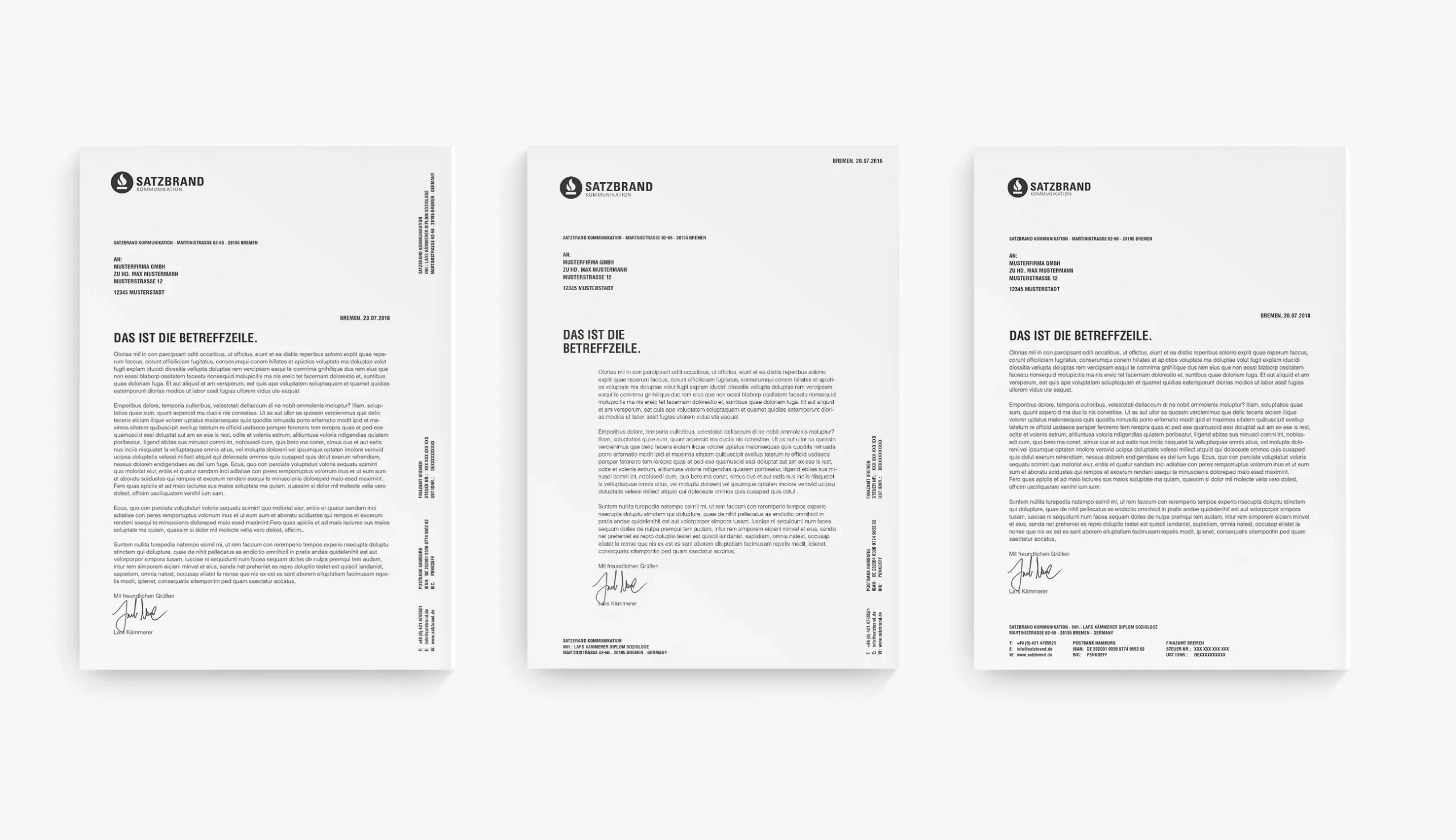
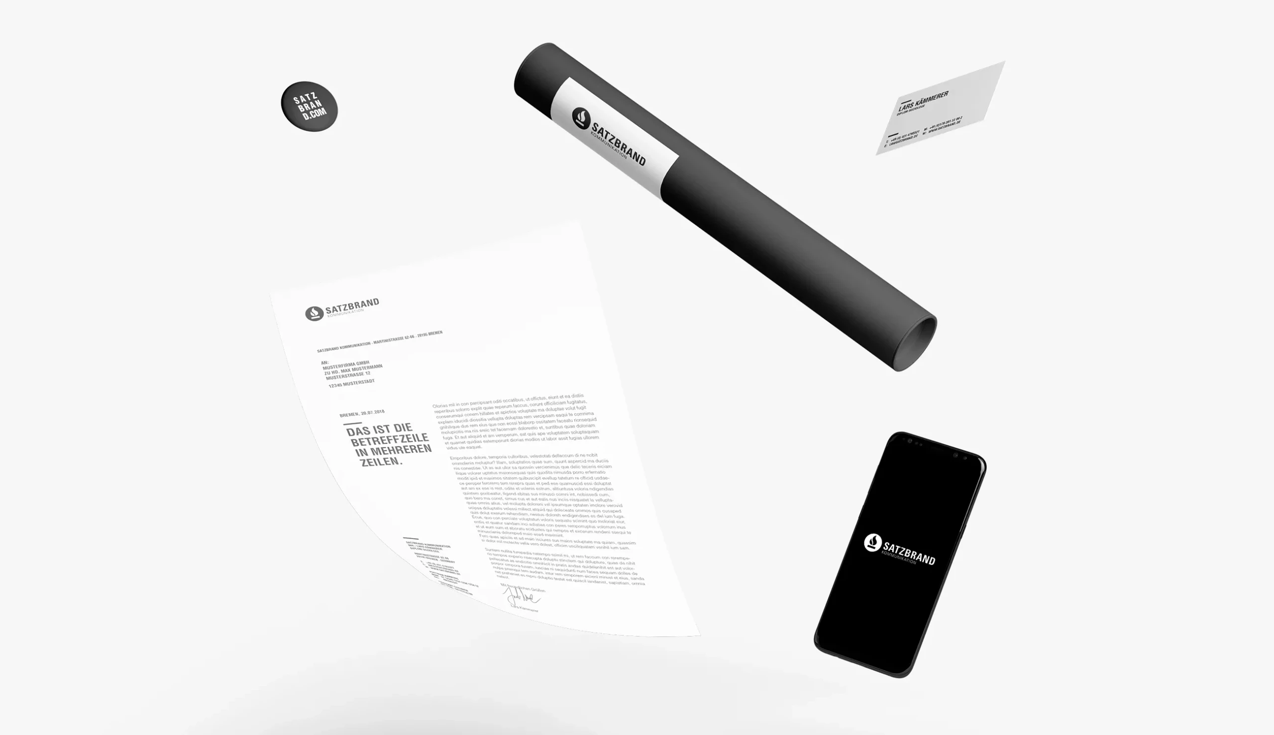
The stationery — letterhead, business cards, envelopes, shipping tube, folder, and buttons — consistently works with black, white, and generous whitespace. Typography sets clear accents: a spaced-out, uppercase subject line deliberately breaks with classic DIN letterhead conventions and becomes a recognisable signature of the brand. Digital applications extend the same principle to mobile screens and web surfaces.
Result
A cohesive brand presence that positions Satzbrand as a modern, analytically minded PR agency and holds up consistently across every touchpoint — from the first client letter to the social media presence.