
Challenge
For an institution of this calibre, the visual identity was quietly falling behind. The existing brand no longer reflected the museum's standing — neither its scholarly depth nor its contemporary ambitions. The brief was clear in intent, but genuinely difficult to execute: create a new visual identity that feels timeless without being backward-looking, and approachable without being superficial.
The identity also had to perform across an unusually wide range of applications. A brand that works on a scholarly catalogue must equally hold its own on a tote bag or a digital banner. Getting that range right — without it feeling like a compromise — was the core design challenge.
Solution
We started where the museum itself starts: with the work. Rather than imposing a visual language from the outside, we looked for what was already latent in the museum's character — precision, depth, a certain quietness that commands attention.
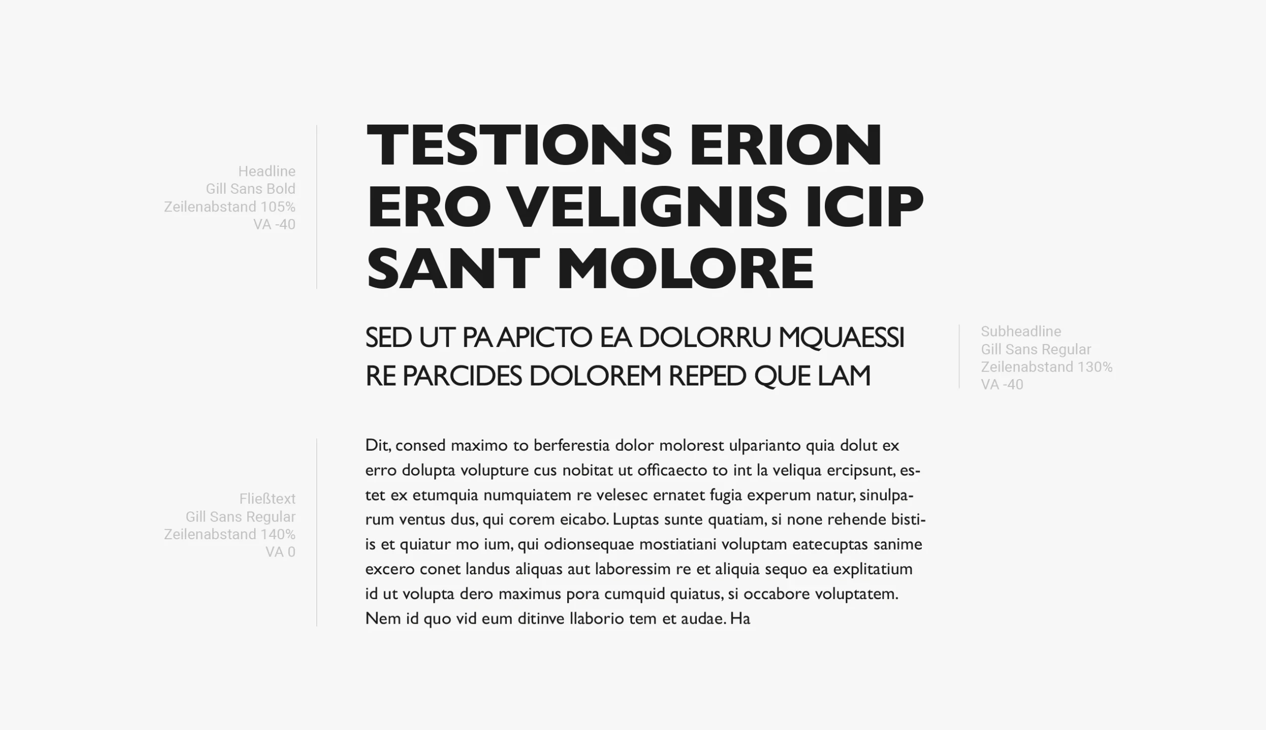
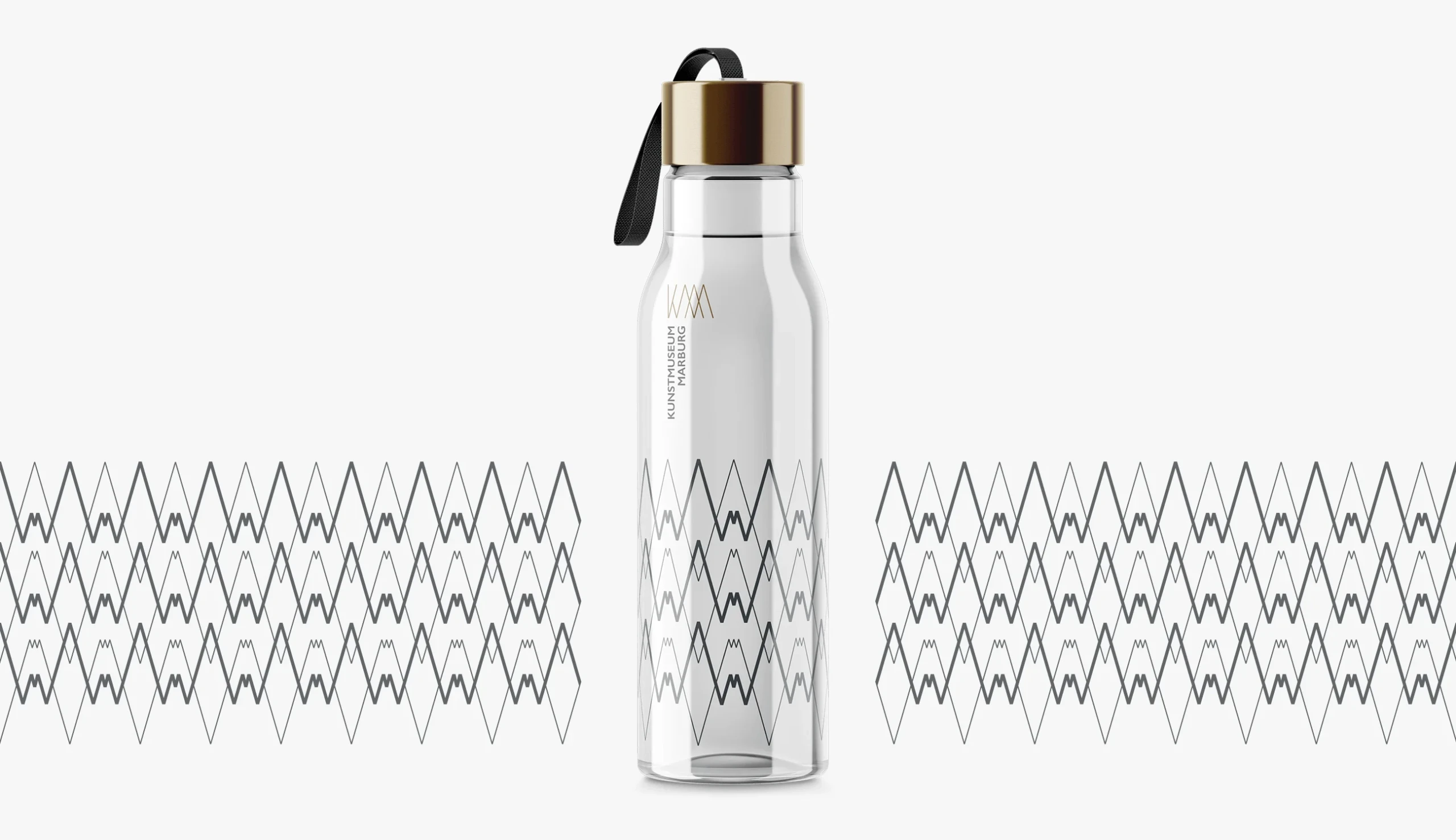
The result is a mark that earns its authority through restraint. Clean geometry, considered proportions, and a typographic system that scales from exhibition signage down to letterhead without losing its presence. The colour palette was kept deliberately narrow — giving the identity room to breathe and ensuring the art always remains the focal point.
The design system was built to be used by the museum's own team without constant agency involvement. That meant robust templates, clear usage guidelines, and a visual logic that's easy to follow even for non-designers.
Our Services
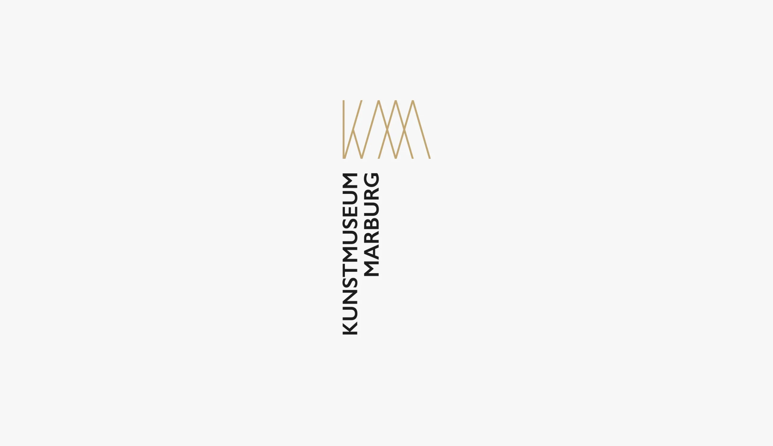
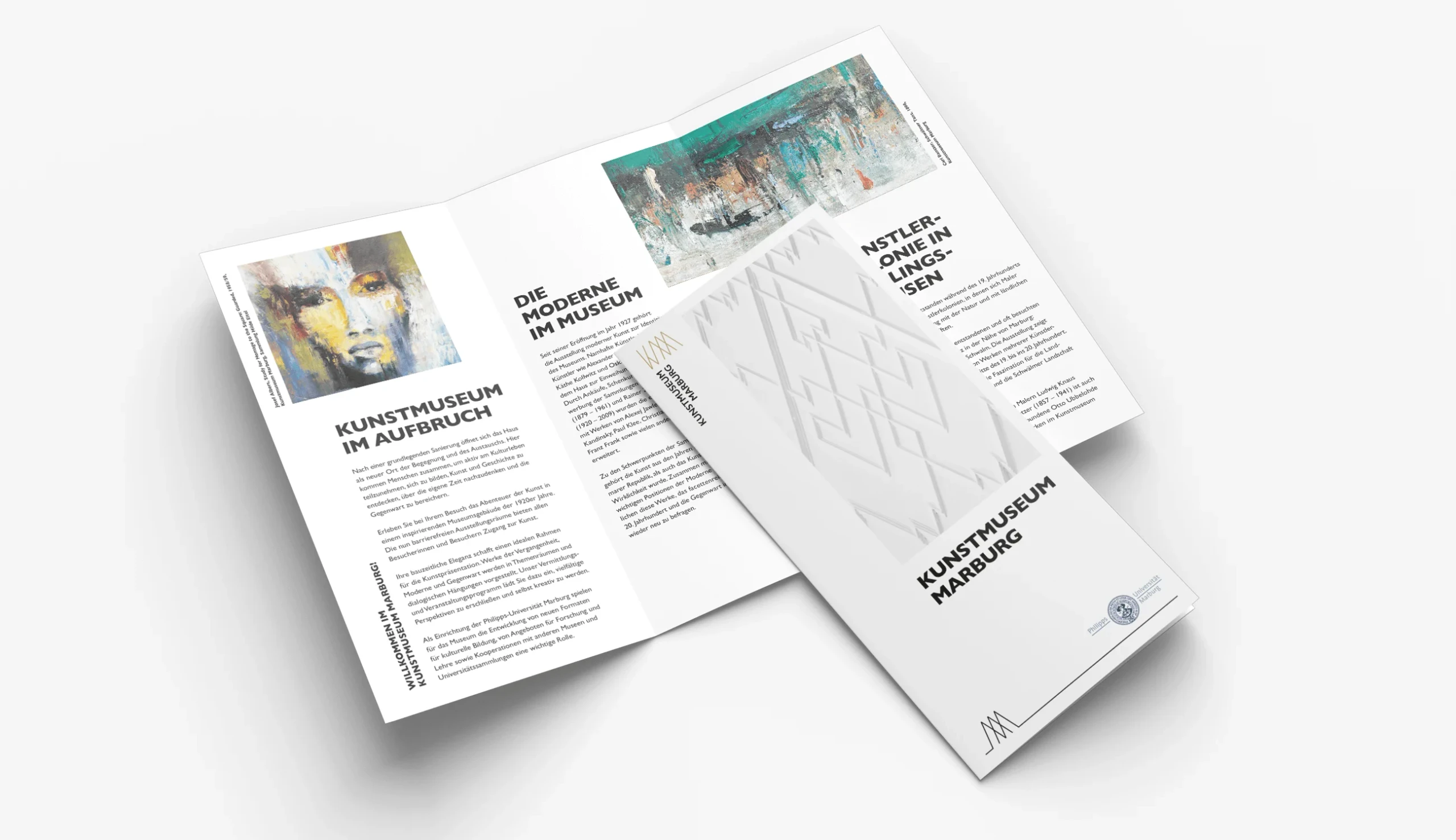
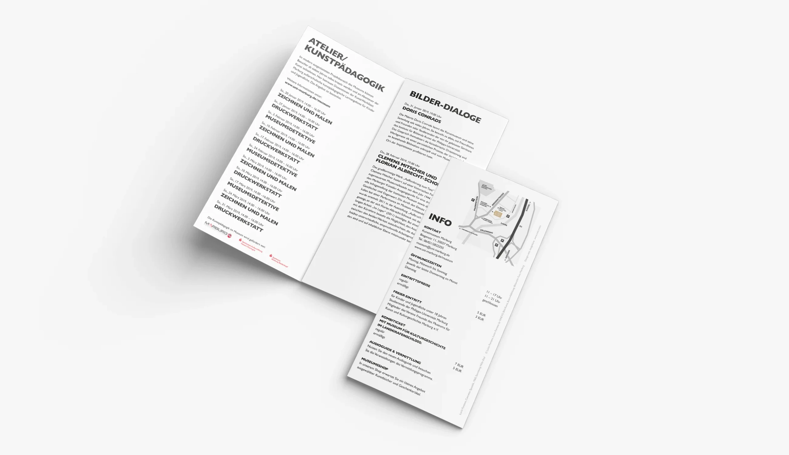
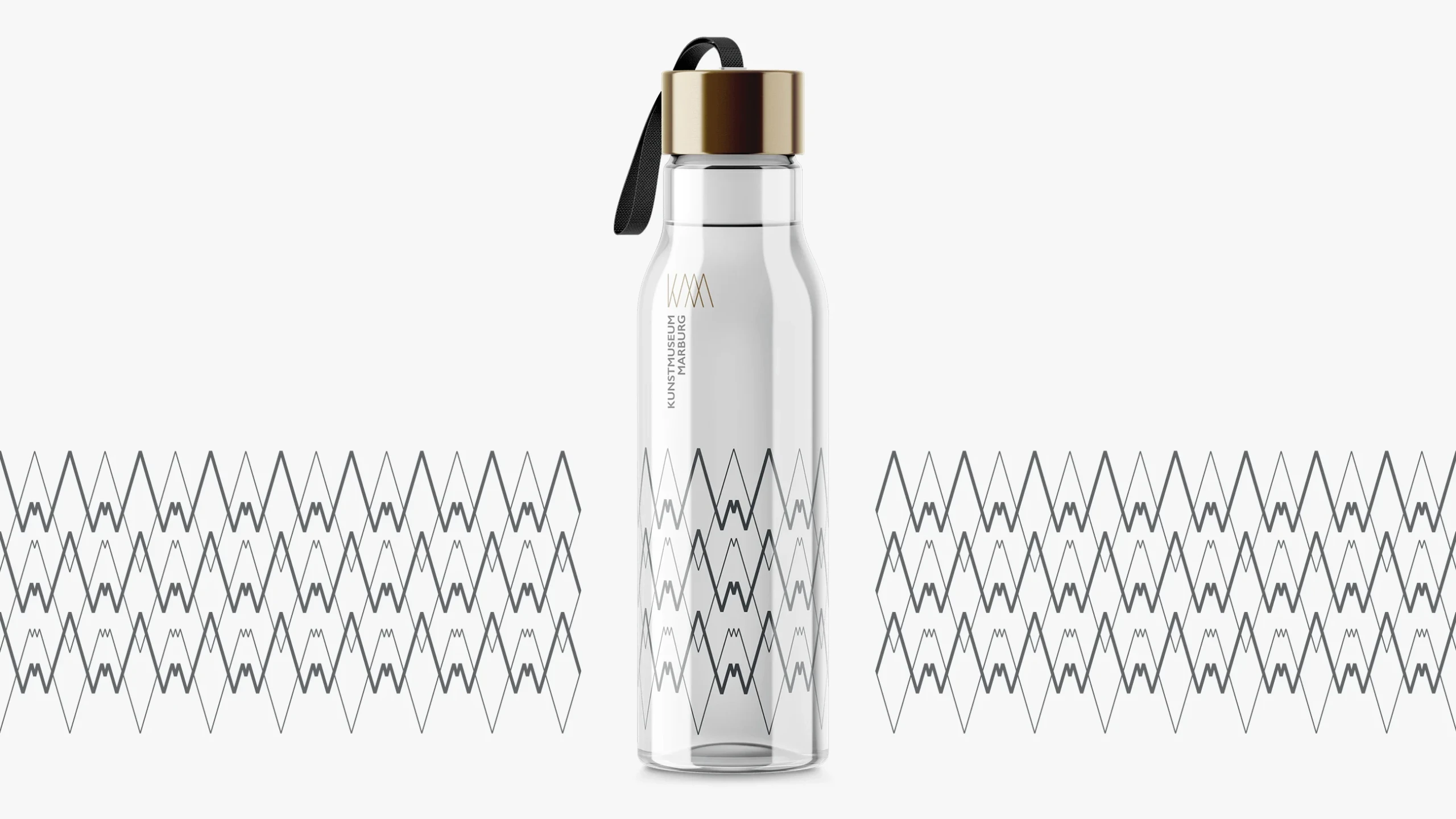
- Logo Relaunch: A new mark built for longevity — precise enough for an academic audience, open enough for the general public, and recognisable at every scale
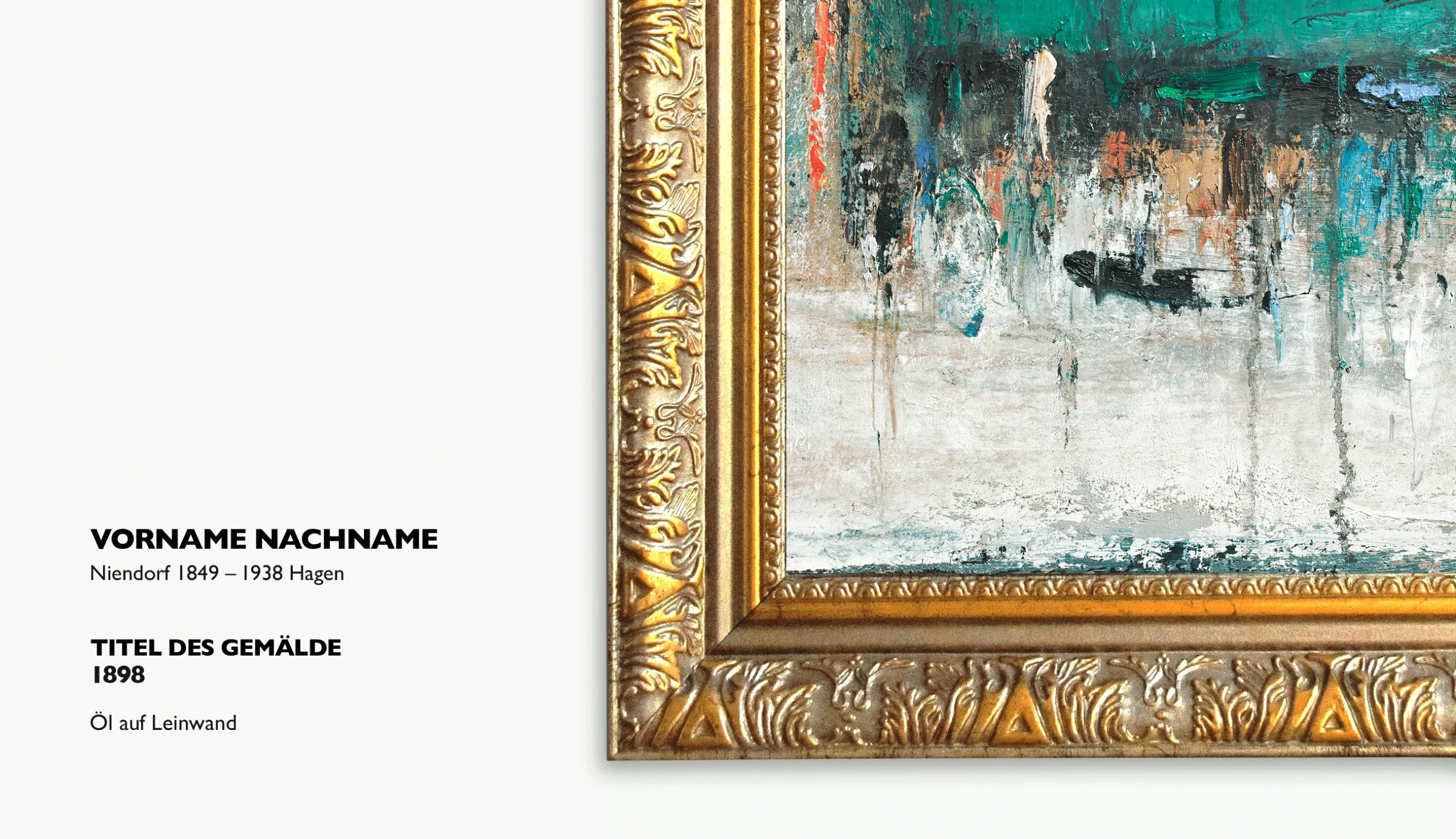
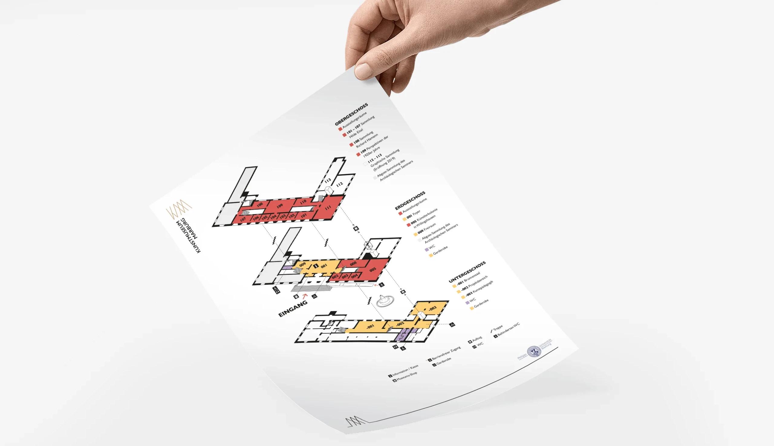
- Corporate Design: A complete design system covering typography, colour, layout principles, and visual language — documented for consistent in-house use
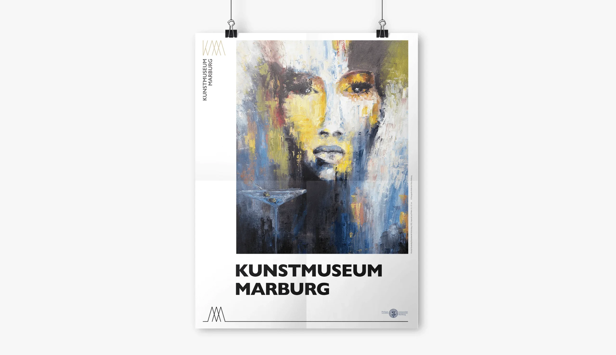
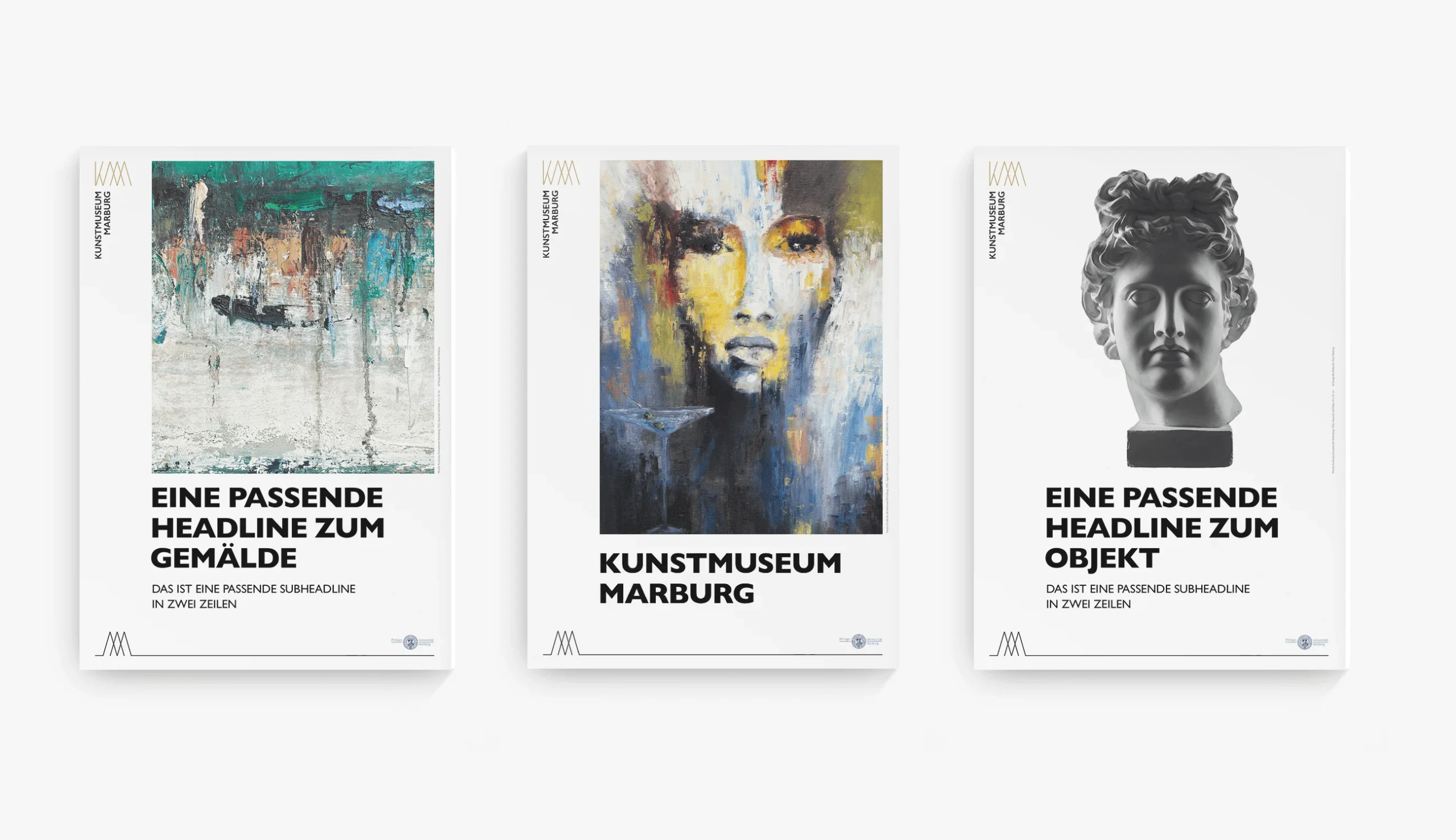
- Print Design: Museum publications, stationery, invitations, and exhibition materials that position the institution with quiet confidence
- Merchandise Design: A range of museum shop items that translate the brand identity into objects people actually want to own
Result
The new identity launched to strong internal reception — and was subsequently recognised with a German Design Award Honorable Mention, one of the most respected design accolades in Germany.
More importantly, the museum now has a visual foundation it can grow into. The brand works. It holds together across contexts, communicates the right things to the right people, and — crucially — it doesn't need to be redesigned every few years.
What we learned: cultural institutions often carry more creative ambition than they're given credit for. The Kunstmuseum team knew exactly what they wanted; our job was to find the form it should take. The best brand work happens when the client is a genuine collaborator — and this was that kind of project.