Feed Me Daily: Logo & Brand Relaunch
All Projects

Feed Me Daily: Logo & Brand Relaunch

Feed Me Daily

Industry
Food & Lifestyle
Services
Branding · Corporate Design

About the Client

Feed Me Daily is a food and lifestyle brand built for the content age — recipes, food culture, and the daily ritual of eating well. The brand needed an identity as bold and shareable as the content it produces, one that would build recognition across social media platforms while also translating to physical merchandise and product collaborations.

TL;DR Results

Bold, distinctive logo instantly recognisable in the fast-moving social media context

Brand system that scales from profile thumbnail to laser-engraved cutting board without losing character

Colour palette and icon language that communicate food, quality, and personality at a glance

Visual identity ready for the brand's growth across content, merchandise, and product

Challenge

In the food content space, personality is the product. Generic, corporate-feeling design destroys the credibility that food creators work hard to build — an audience that follows you for your recipes will not forgive a logo that looks like a franchise. The identity had to feel genuinely character-led: bold, a little irreverent, and immediately shareable.

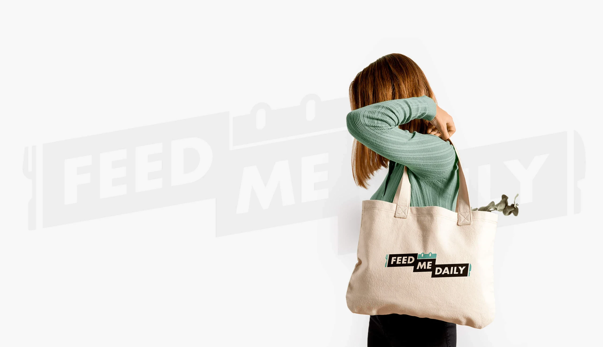
At the same time, the brand needed to be more than just a social media presence. Feed Me Daily was growing into merchandise, product collaborations, and physical retail contexts — all of which demand a mark that holds together in formats well beyond an Instagram profile.

Solution

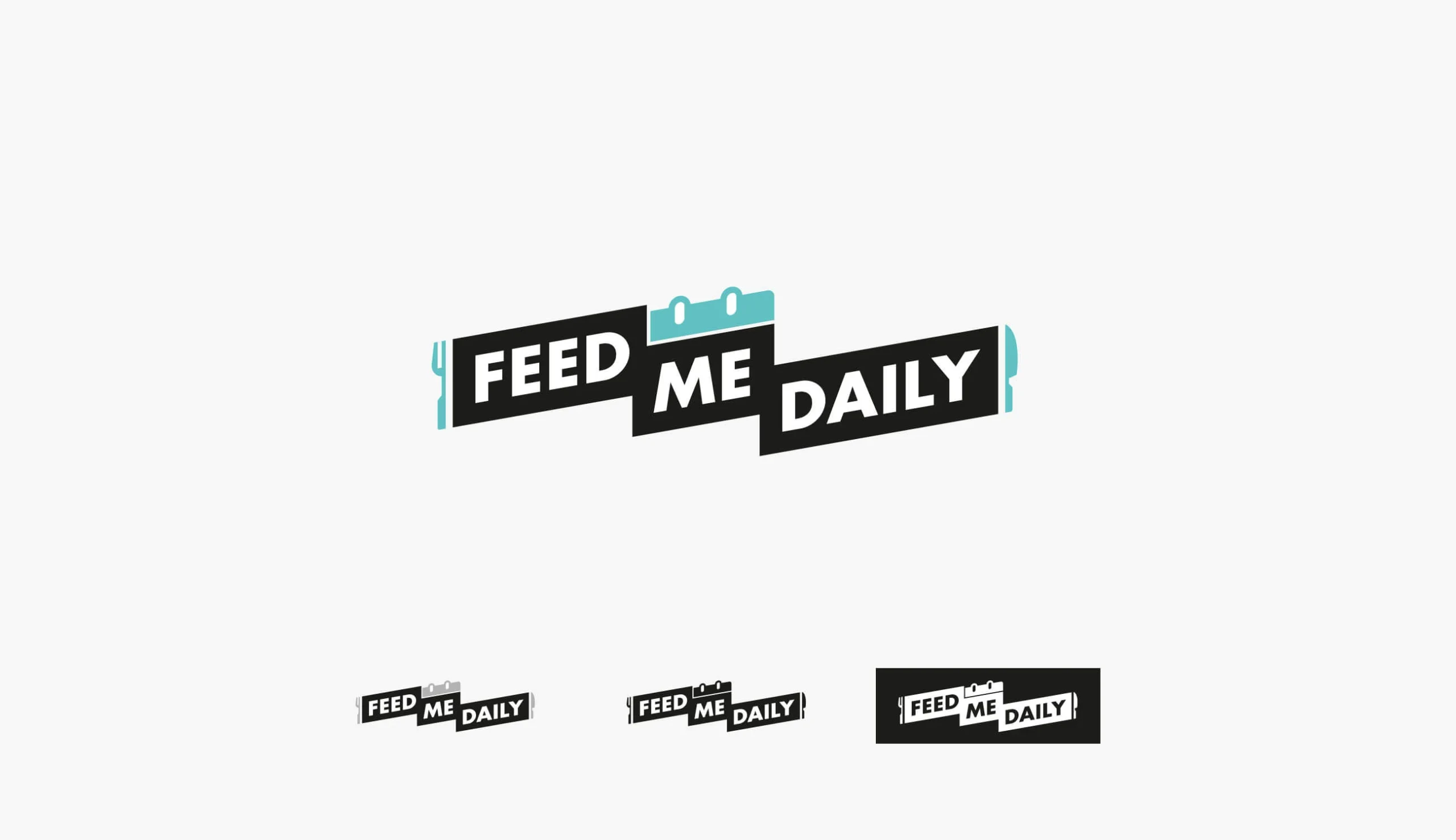
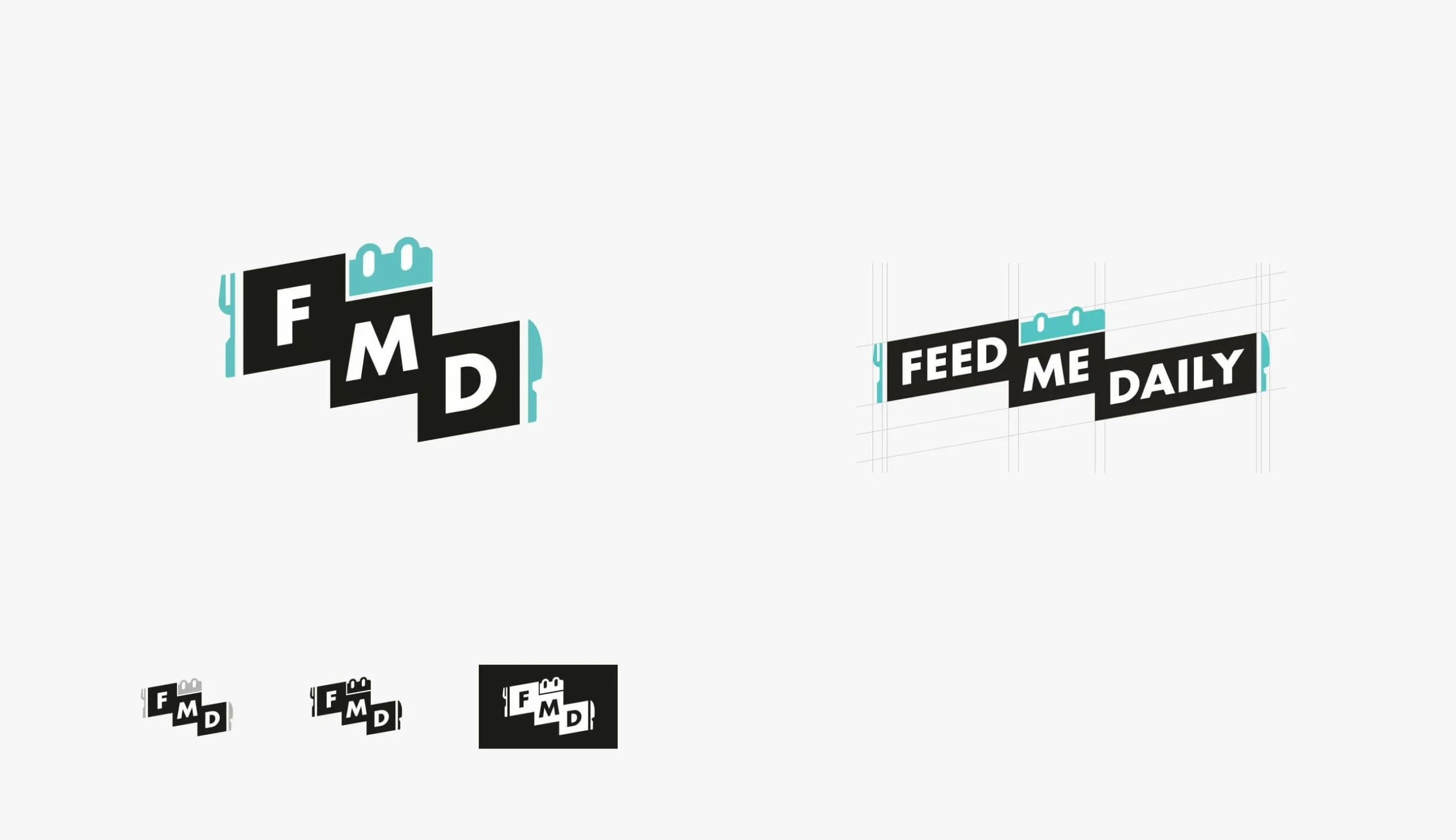
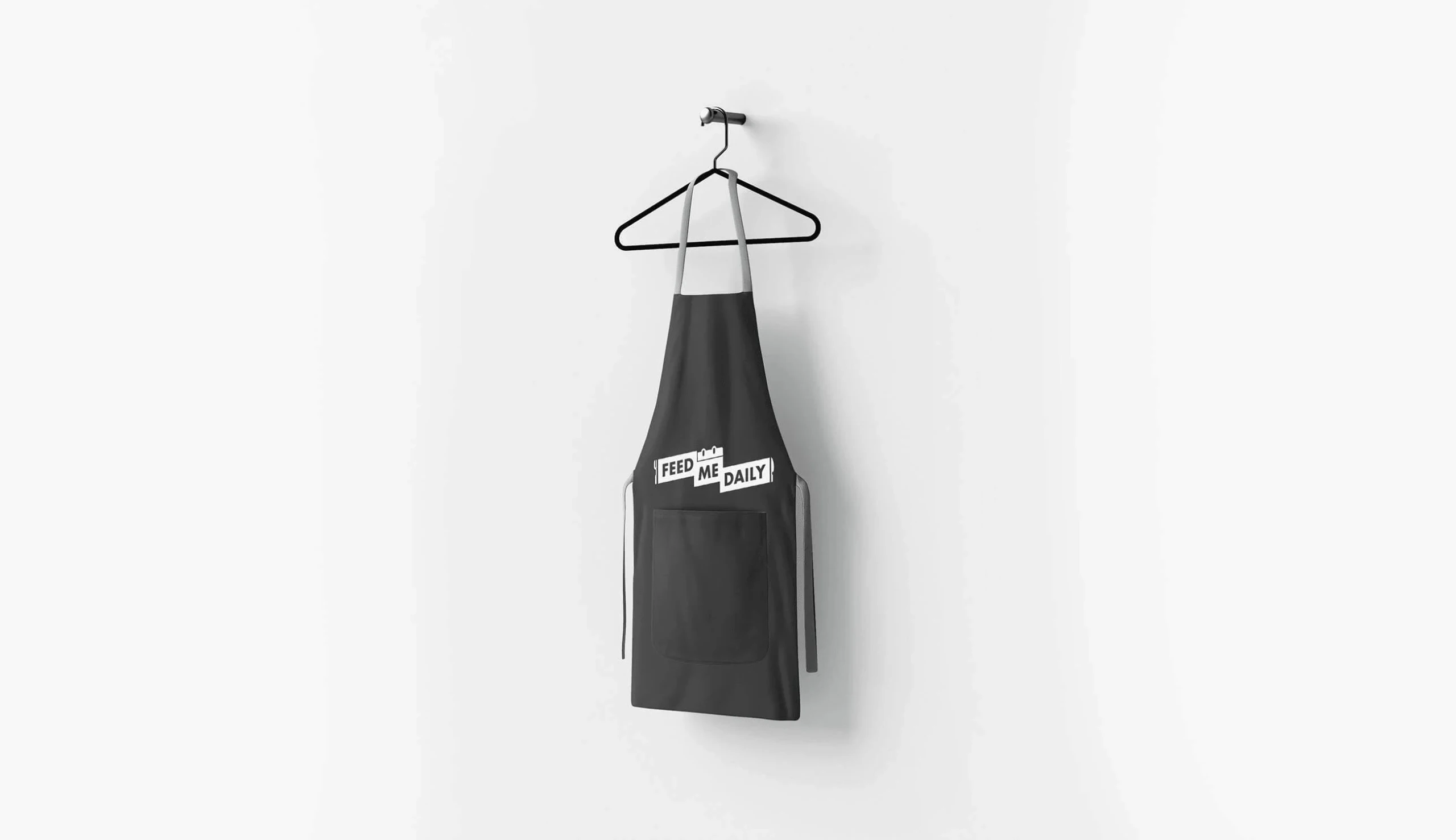
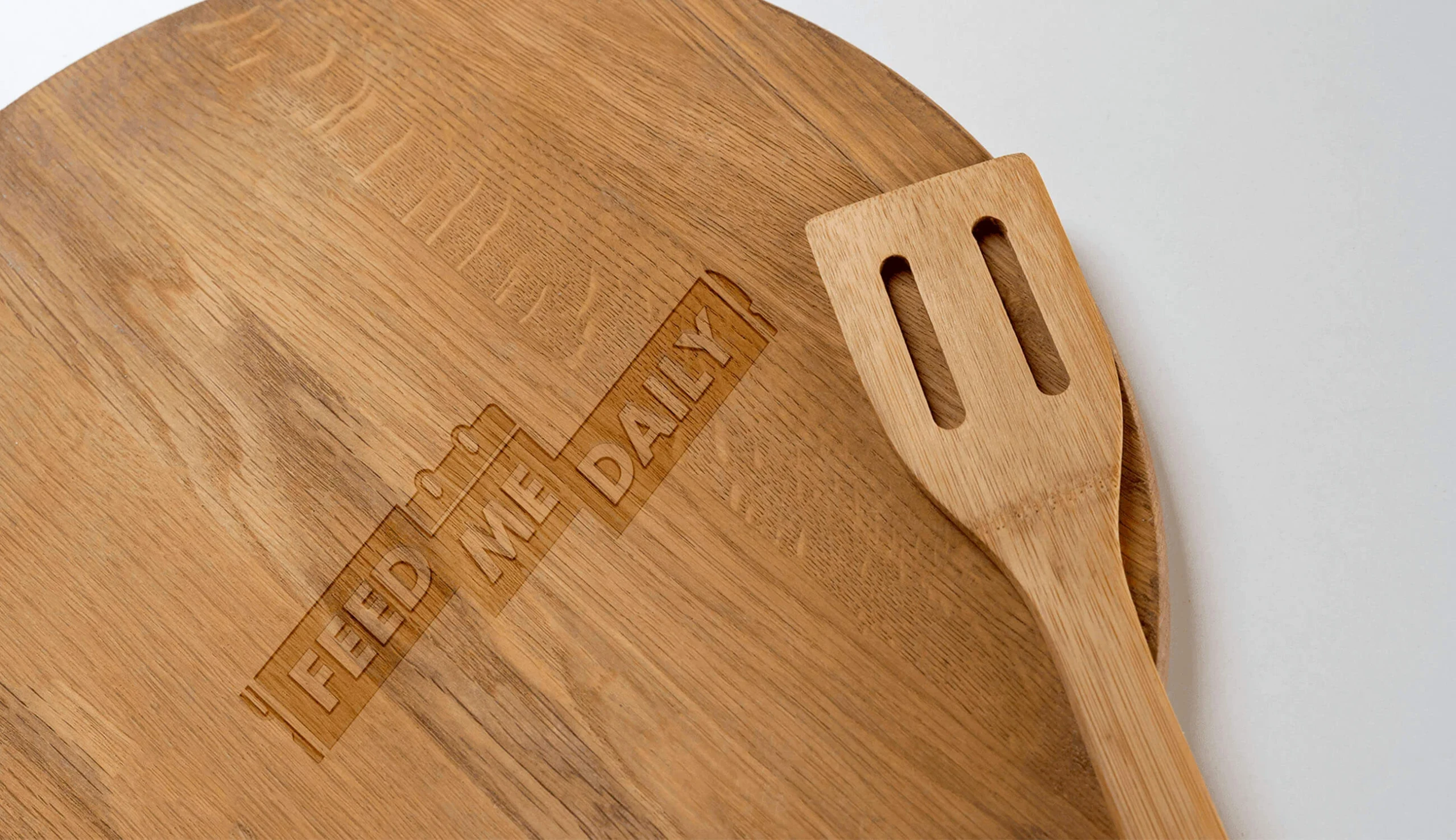
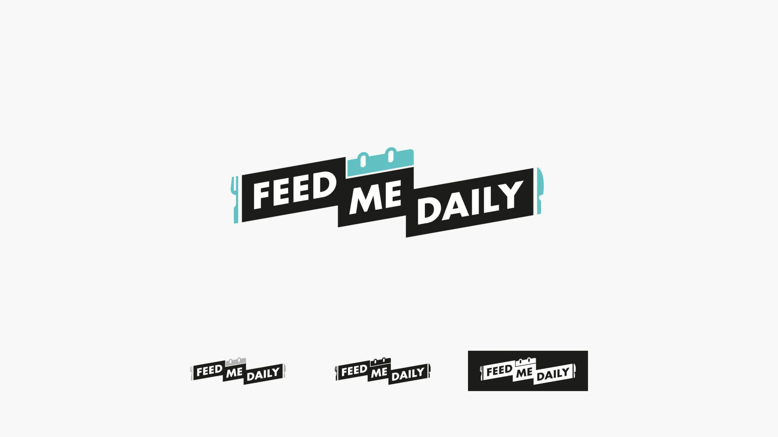
We designed a logo around the inherent geometry of the name itself: three staggered banner forms that stack and shift like a meal being plated. The teal calendar icon embedded at the top — the "daily" in Feed Me Daily — locks in the brand's routine-focused identity, while the fork and knife cutouts anchoring each end make the food connection unmistakable.

The result is a wordmark with genuine energy. It's bold enough to read at thumbnail scale, distinctive enough to own its space in a feed, and structured enough to engrave cleanly on a cutting board.

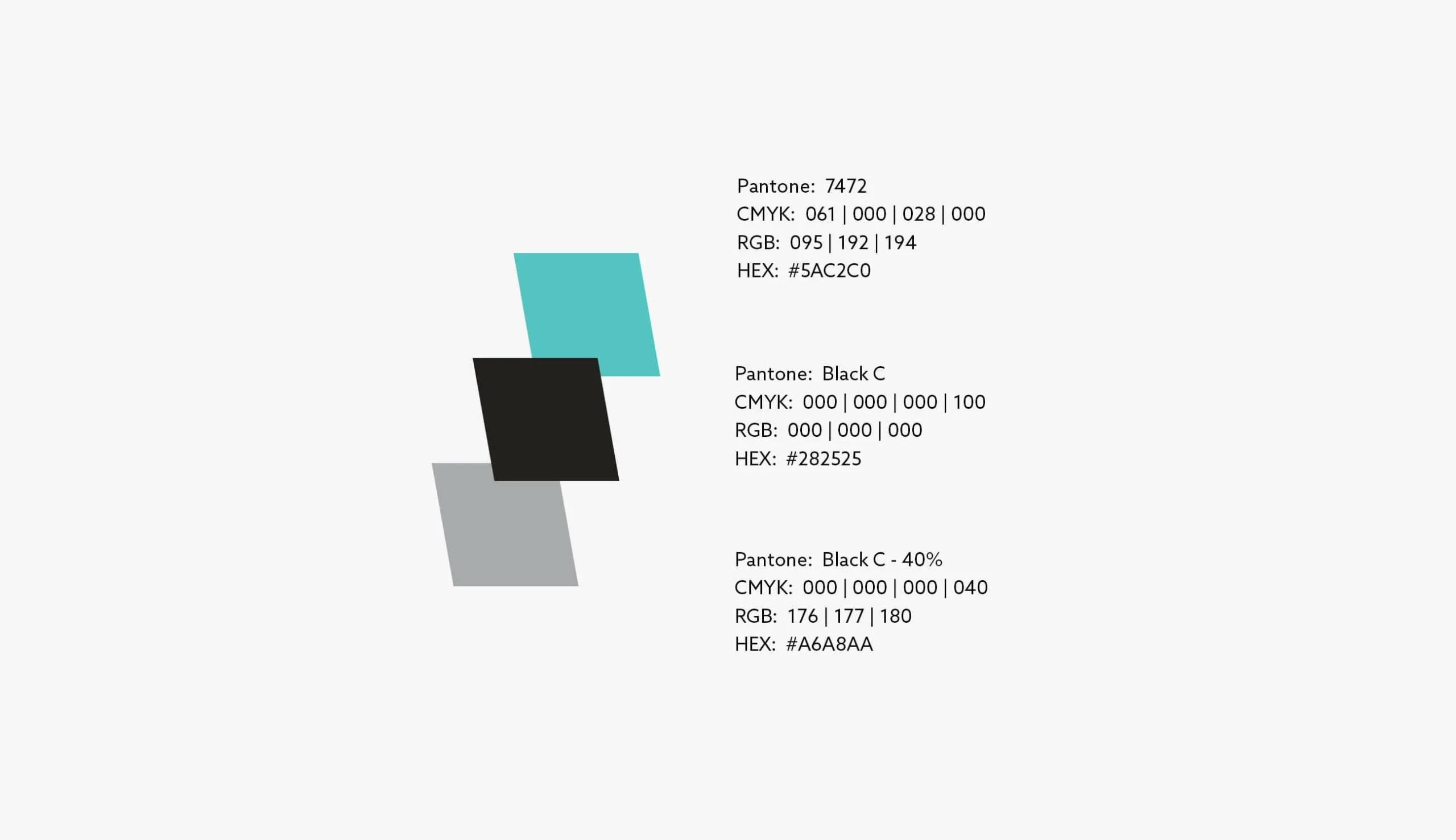
The colour palette is deliberately restrained: teal, near-black, and mid-grey. The contrast does the work. The teal is the accent; the black is the authority; the grey gives the system flexibility for neutral applications.

Our Services

  • Logo Relaunch: A new wordmark with genuine character — built for digital-first visibility and flexible enough for physical product applications
  • Corporate Design: A visual identity system that gives the brand consistency across its diverse range of digital and physical touchpoints

Result

A brand identity that feeds the audience as well as the content does. The new Feed Me Daily mark is immediately recognisable, translates across every context from Reels to retail, and gives the brand a visual identity as full of personality as its name.

Feed Me Daily: Logo & Brand Relaunch screenshot 1
Logo suite — staggered 'FEED ME DAILY' wordmark with teal calendar icon and fork/knife cutouts, shown in three compact variants
Feed Me Daily: Logo & Brand Relaunch screenshot 2
Logo construction — FMD monogram mark and full wordmark with construction grid, plus size-scaling variants
Feed Me Daily: Logo & Brand Relaunch screenshot 3
Brand colour palette — teal (Pantone 7472), near-black, and mid-grey with Pantone, CMYK, RGB, and HEX specifications
Feed Me Daily: Logo & Brand Relaunch screenshot 4
Merchandise — branded canvas tote bag in a lifestyle shot with oversized watermarked logo in the background
Feed Me Daily: Logo & Brand Relaunch screenshot 5
Merchandise — dark chef's apron with Feed Me Daily wordmark in white
Feed Me Daily: Logo & Brand Relaunch screenshot 6
Product application — logo laser-engraved on a round oak cutting board, photographed with a wooden spatula

Let's build something remarkable.

You have a vision. We have the team to make it real.
Tell us what you're building — we'll tell you exactly how to make it exceptional.

Most inquiries get a personal reply quickly.

Free first consultation · No commitment · Award-winning team

Why serious companies choose us.

15 years. 100+ projects. Award-winning work.

The people who pitch are the people who build.

No layers, no handoffs, no revolving door of faces. The developers and designers you meet at the start are the same ones shipping your product at the end.

We've been the client too.

We build our own software products. We know the frustration of missed deadlines and vague updates — so we built our process to be the agency we always wished existed.

15 years of pattern recognition.

We know which technologies age well, which don't, and which were just hype. That judgment — earned the hard way — protects your budget and your roadmap.

You'll always know where things stand.

Weekly updates, clear milestones, no surprises. If something changes, you hear it from us first — not when the deadline passes.

Your code. Your freedom.

No proprietary systems, no lock-in. We build on open source and hand over full ownership. Change agencies tomorrow if you want. (You won't want to.)

Good enough is not in our vocabulary.

Internal reviews, design critiques, QA loops — before anything reaches you. We only ship things we're proud to put our name on.