Brand Design That Works: From Strategy to Design System
TL;DR — Effective brand design in 2026 is a system, not a logo. It starts with strategic positioning, manifests through a coherent visual language (typography, color, motion), and scales through design tokens that synchronize every touchpoint automatically. The brands that win are the ones where every pixel reinforces the same story — whether on a billboard, a mobile app, or an invoice. :
Why Most Brand Design Projects Fail
The typical brand design project starts with excitement and ends with a PDF nobody opens. A beautifully designed brand book gets delivered, the team applauds, and within six months the brand has drifted back into inconsistency. Sales uses the old logo. Marketing picks colors that "feel right." The product team invents new button styles because the brand guidelines don't cover their use case.
This happens because most brand projects confuse deliverables with systems. A logo, a color palette, and a font selection are deliverables. A brand design system — one that's integrated into the actual tools people use — is what creates lasting consistency.
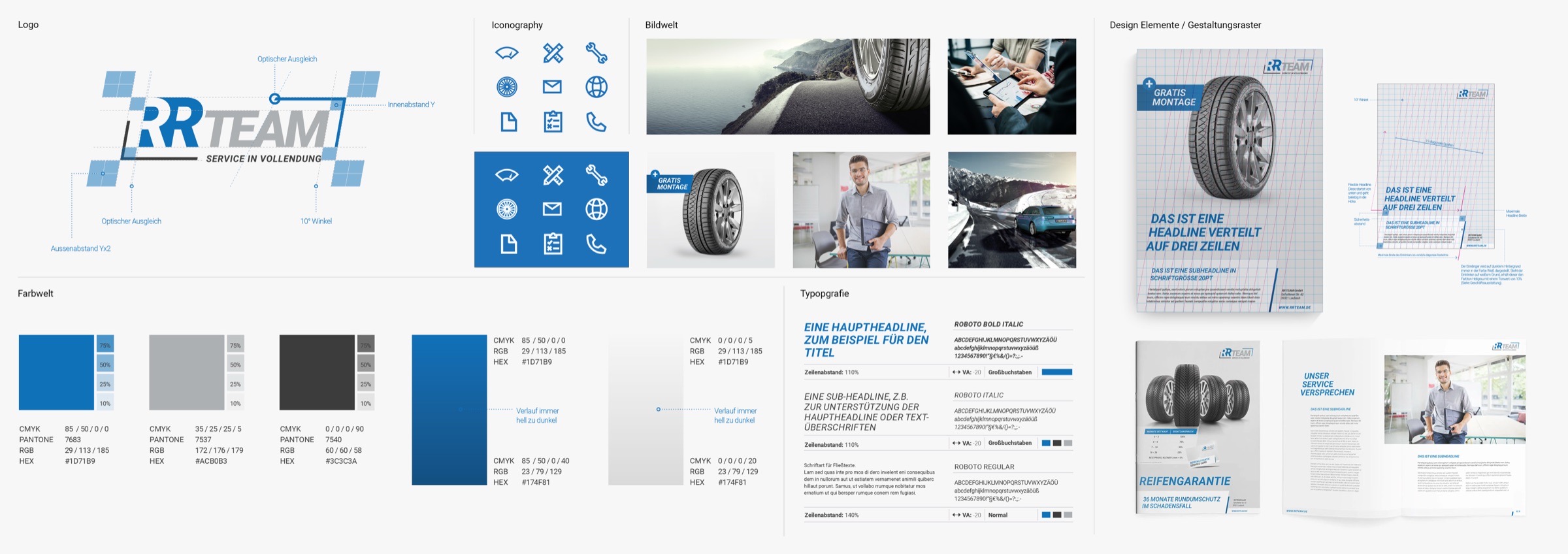
When we delivered the rebrand for Parkett Hinterseer (28 locations across Germany), that was exactly the challenge: a brand that needs to work consistently across outdoor advertising, product packaging, retail interiors and digital channels simultaneously. The result — a complete brand system comprising logo, typography, icon set and colour palette — was recognised with the German Design Award 2025.
This guide covers the full arc: from the strategic foundation that gives a brand its reason to exist, through the visual decisions that make it recognizable, to the technical infrastructure that keeps it consistent at scale.
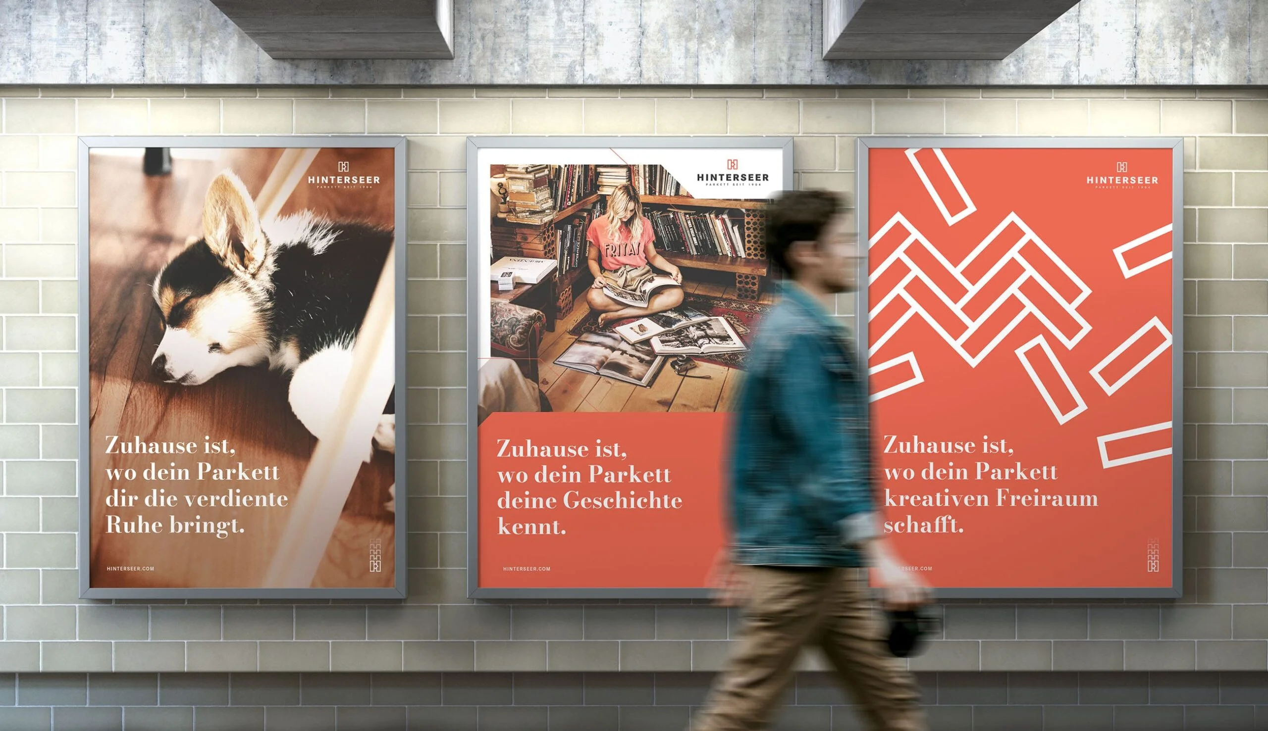
Complete rebrand for Germany's leading premium flooring retailer — logo, corporate design, print, packaging and editorial design across 28 locations.
Strategic Positioning: The Foundation Nobody Wants to Do
Before touching Figma, a brand needs to answer three questions with uncomfortable clarity:
- Who are we for? Not "everyone." A specific audience with specific needs.
- What do we do differently? Not "better quality." A concrete, defensible difference.
- Why should anyone care? Not features. The outcome the audience actually wants.
These answers form the brand positioning — the strategic bedrock everything visual is built upon. Without it, design becomes decoration.
The Positioning Framework
A practical positioning statement follows this structure:
For target audience who need core need, brand name is the category that key differentiator because proof points.
This isn't a tagline. It's an internal alignment tool. Every design decision, every copywriting choice, every product feature should be traceable back to this statement. If a visual direction doesn't reinforce the positioning, it's wrong — no matter how beautiful it looks.
With Caja von Steinling, the positioning was clear: luxury dog accessories that stand apart from the mass market — not through decoration, but through restraint and precision. That informed every design decision: the minimalist custom lettering of the wordmark, the logo optimised for leather embossing at 3mm, the reduced colour palette.
Competitive Landscape Mapping
Positioning doesn't happen in isolation. Map your visual territory against competitors on two axes that matter to your audience. Common pairings:
- Premium vs. Accessible (price positioning)
- Traditional vs. Innovative (market approach)
- Corporate vs. Human (communication style)
- Specialist vs. Generalist (scope positioning)
Find the quadrant that's genuinely unoccupied — or underserved — and own it visually. If every competitor in your space uses blue and sans-serif typography, that's useful information. You can either join them (signaling category belonging) or deliberately diverge (signaling differentiation). Both are valid strategies. What's not valid is defaulting into sameness by accident.
Brand development for a luxury leather goods label — logo optimised for leather embossing, WordPress e-commerce, full print collateral including packaging.
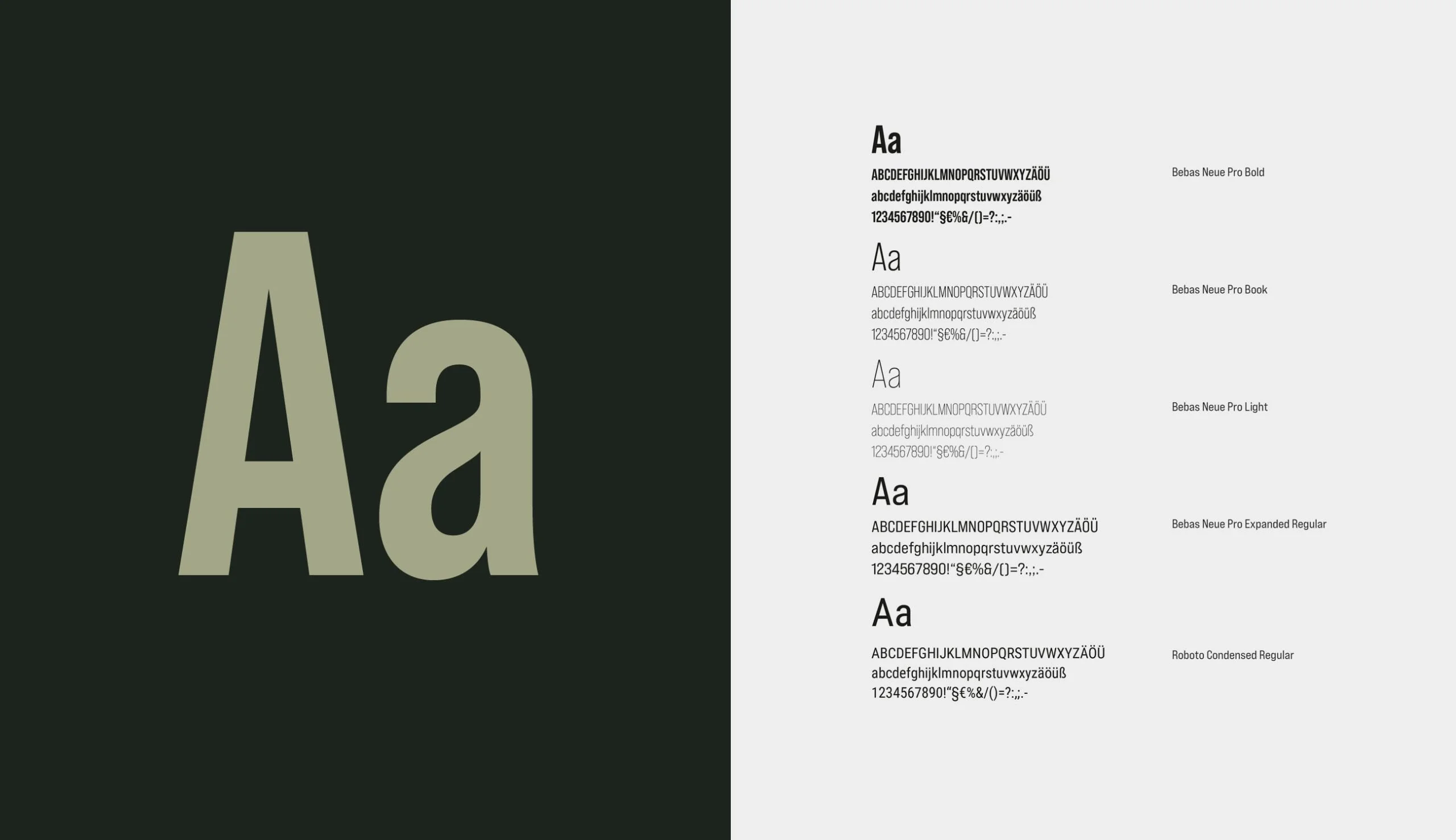
Typography: The Most Underestimated Brand Asset
If you could only choose one element of your visual identity, choose typography. Color is emotional but imprecise — many brands share the same blue. Photography can be replicated. But typography sets the tone of every piece of communication, every interface element, every document your brand produces.
Choosing a Type System
A functional brand typography system needs three roles:
Display typeface — Used for headlines, hero sections, and high-impact moments. This is where personality lives. A geometric sans-serif communicates precision. A humanist serif signals authority and warmth. A custom variable font says "we invest in details."
For the Parkett Hinterseer rebrand, we paired Bodoni Nova as the editorial display face with Corporate S for subheadlines and body copy — the serif-sans pairing positions the brand as both premium and approachable.
Body typeface — The workhorse that carries long-form content, UI labels, and documentation. Optimized for readability at small sizes across screens. Generous x-height, open apertures, clear distinction between similar letterforms (Il1, O0).
Monospace typeface (if applicable) — For code, data tables, and technical contexts. Aligns with the overall brand personality but serves a functional purpose.
Type Scale Architecture
A well-structured type scale defines every text size your brand will ever need. Fewer sizes, used consistently, create stronger visual rhythm than many sizes used arbitrarily.
/* A systematic type scale based on a 1.25 ratio */
:root {
  --fs-2xs: 0.64rem;   /* 10.24px — captions, legal */
  --fs-xs:  0.8rem;     /* 12.8px  — labels, metadata */
  --fs-sm:  0.9rem;     /* 14.4px  — secondary text */
  --fs-base: 1rem;      /* 16px    — body copy */
  --fs-md:  1.125rem;   /* 18px    — lead paragraphs */
  --fs-lg:  1.25rem;    /* 20px    — subheadings */
  --fs-xl:  1.563rem;   /* 25px    — section titles */
  --fs-2xl: 1.953rem;   /* 31.25px — page headings */
  --fs-3xl: 2.441rem;   /* 39px    — hero secondary */
  --fs-4xl: 3.052rem;   /* 48.8px  — hero primary */
}
The key discipline: never invent new sizes. If a design needs a size that's not in the scale, the answer is usually that the design needs to change — not the system.
Color Architecture: Beyond the Palette
Brand color isn't about picking five colors that look nice together. It's about building a functional color system that works in every context — from a dark-mode mobile app to a printed business card under fluorescent lighting.
The Three-Layer Color Model
Layer 1: Core palette — The raw color values that define the brand. Typically 1–2 primary colors, 1–2 secondary colors, and a neutral scale. These are the source of truth but are never used directly in production.
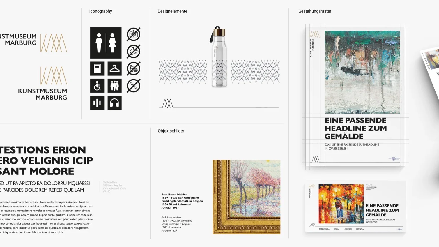
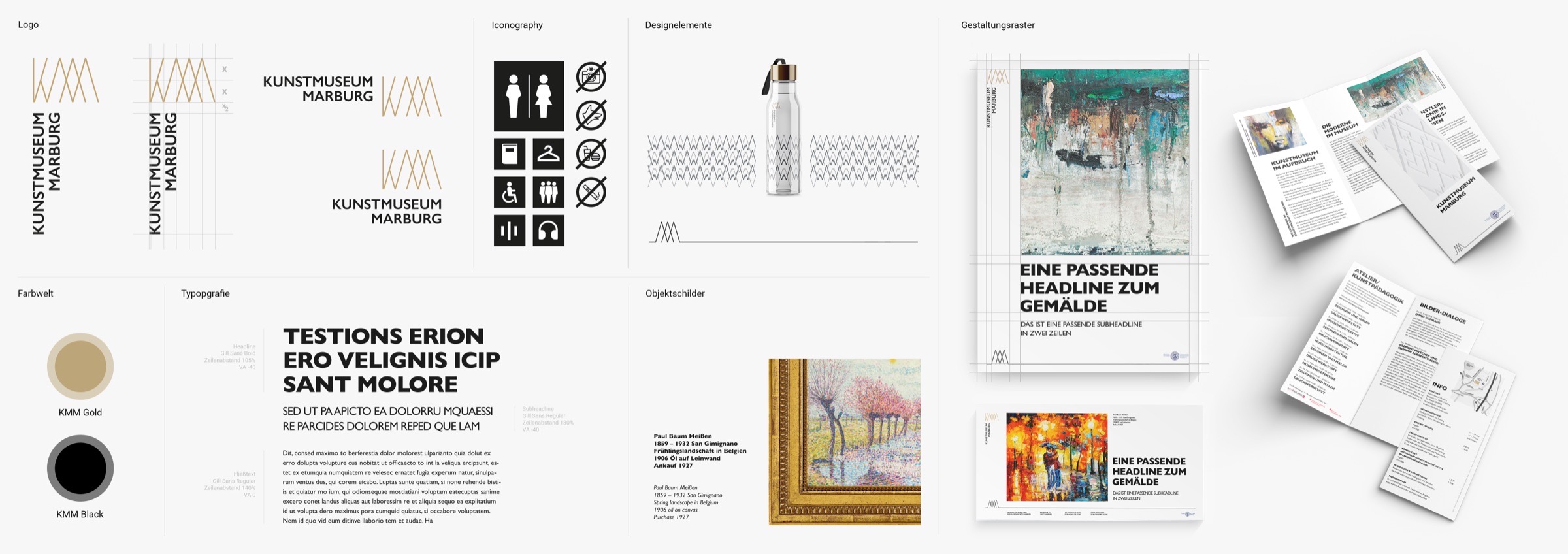
For the Kunstmuseum Marburg, we deliberately reduced the colour palette to just two tones: KMM Gold and KMM Black. A cultural institution doesn't need a rainbow — it needs colours that can stand alongside artworks spanning six centuries without competing with them.
Layer 2: Semantic tokens — Contextual mappings that assign meaning. color-primary points to a core value. color-text maps to the appropriate neutral. color-error maps to a red that's been tested for contrast compliance.
Layer 3: Component tokens — Specific usage contexts. button-primary-bg, card-border, input-focus-ring. These create a predictable, maintainable interface between design intent and implementation.
{
  "color": {
    "core": {
      "blue-600": { "value": "#0052CC" },
      "blue-100": { "value": "#E6F0FF" },
      "neutral-900": { "value": "#1A1A2E" },
      "neutral-100": { "value": "#F5F5F7" }
    },
    "semantic": {
      "primary": { "value": "{color.core.blue-600}" },
      "bg-page": { "value": "{color.core.neutral-100}" },
      "text-body": { "value": "{color.core.neutral-900}" }
    },
    "component": {
      "button-primary-bg": { "value": "{color.semantic.primary}" },
      "button-primary-text": { "value": "#FFFFFF" }
    }
  }
}
Accessibility-First Color Selection
Every color pairing in the system must meet WCAG 2.1 AA contrast requirements:
- 4.5:1 minimum for body text
- 3:1 minimum for large text (18px+ or 14px bold)
- 3:1 minimum for UI components and graphical objects
This isn't optional. Beyond legal compliance in many markets, poor contrast directly reduces conversion rates. Users who can't read your content can't buy your product.
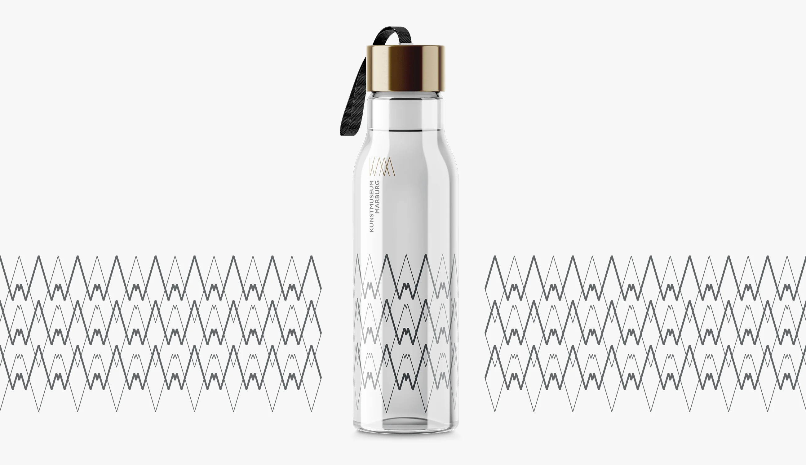
Logo relaunch and complete rebrand for one of Germany's most important university art museums — corporate design, print design and merchandise.
Motion as Brand Language
Static brands are incomplete brands. In 2026, motion is a core identity element — not an afterthought added during implementation. The way elements enter a page, how buttons respond to interaction, how content transitions between states — these behaviors communicate personality as powerfully as color or typography.
Defining Motion Principles
A brand's motion language should be defined through principles, not individual animations:
Tempo — Is the brand energetic and quick, or measured and deliberate? This determines base duration values. A fintech brand might use 150–250ms transitions (efficient, responsive). A luxury brand might use 400–600ms (considered, premium).
Easing — The acceleration curve tells a story. Linear motion feels mechanical. Ease-out feels responsive and natural. Spring-based easing feels playful and physical. Pick one family and use it consistently.
Choreography — How do multiple elements relate in motion? Staggered entrances imply hierarchy. Simultaneous transitions imply equality. Connected animations (where one element's exit triggers another's entrance) imply narrative flow.
:root {
  /* Motion tokens */
  --duration-fast: 150ms;
  --duration-normal: 250ms;
  --duration-slow: 400ms;
  --ease-default: cubic-bezier(0.25, 0.1, 0.25, 1);
  --ease-enter: cubic-bezier(0, 0, 0.2, 1);
  --ease-exit: cubic-bezier(0.4, 0, 1, 1);
}
Design Tokens: The Technical Bridge
Design tokens are the mechanism that turns a brand identity from a PDF into a living system. They're named entities — color.primary, spacing.lg, font.heading — stored in a machine-readable format (typically JSON) and transformed into platform-specific code: CSS custom properties for web, Swift constants for iOS, XML resources for Android, Figma variables for design.
Token Architecture in Practice
{
  "spacing": {
    "2xs": { "value": "4px" },
    "xs":  { "value": "8px" },
    "sm":  { "value": "12px" },
    "md":  { "value": "16px" },
    "lg":  { "value": "24px" },
    "xl":  { "value": "32px" },
    "2xl": { "value": "48px" },
    "3xl": { "value": "64px" }
  },
  "borderRadius": {
    "none": { "value": "0" },
    "sm":   { "value": "4px" },
    "md":   { "value": "8px" },
    "lg":   { "value": "16px" },
    "full": { "value": "9999px" }
  }
}
These tokens get compiled into every platform your brand touches:
/* Generated CSS */
:root {
  --spacing-2xs: 4px;
  --spacing-xs: 8px;
  --spacing-sm: 12px;
  --spacing-md: 16px;
  --spacing-lg: 24px;
}
// Generated Swift
enum Spacing {
    static let xxs: CGFloat = 4
    static let xs: CGFloat = 8
    static let sm: CGFloat = 12
    static let md: CGFloat = 16
    static let lg: CGFloat = 24
}
The power is in the single source of truth. Change the spacing scale once, and every platform updates. Rebrand? Swap the token values and every product reflects the new identity without touching component code.

The Brand Design Process: What Actually Happens
A professional brand design engagement isn't a linear march from brief to delivery. It's a structured cycle of divergence and convergence across four phases.
Phase 1: Discovery (2–4 weeks)
- Stakeholder interviews and alignment workshops
- Competitor visual audit and landscape mapping
- Audience research and persona validation
- Brand positioning refinement or development
- Deliverable: Strategic brief with positioning, personality, and constraints
Phase 2: Visual Exploration (3–4 weeks)
- 2–3 distinct visual directions (mood boards, type explorations, color studies)
- Logo concepts and wordmark development
- Photography and illustration style definition
- Motion language principles
- Deliverable: Approved visual direction with rationale
Phase 3: System Design (3–5 weeks)
- Complete type scale and pairing specifications
- Full color system with semantic and component tokens
- Component library (buttons, cards, forms, navigation patterns)
- Responsive behavior definitions
- Accessibility audit and adjustments
- Deliverable: Design system in Figma with documentation
Phase 4: Implementation & Handoff (2–4 weeks)
- Design token export pipeline (JSON to CSS/Swift/XML)
- Developer documentation and integration guide
- Asset production (logos in all formats, social templates, print templates)
- Brand guidelines (living documentation, not a static PDF)
- Deliverable: Production-ready design system with integration support
Measuring Brand Design Effectiveness
Brand design isn't art — it's a business tool. Measure it accordingly:
Recognition metrics — Unaided recall surveys before and after rebrand. Can people identify your brand from a cropped logo, a color, a typographic treatment?
Consistency score — Audit all touchpoints quarterly. Score each on adherence to the design system. Track improvement over time.
Performance metrics — Conversion rates, time on site, bounce rate. A strong brand identity directly impacts these numbers through trust and clarity.
Production velocity — How fast can the team ship new pages, campaigns, or features? A working design system should measurably accelerate output.
Conclusion
Brand design in 2026 is an engineering discipline as much as a creative one. The brands that maintain consistency across hundreds of touchpoints aren't the ones with the best brand books — they're the ones who built systems. Design tokens replace style guides. Component libraries replace brand books. Automated pipelines replace manual QA.
The creative vision still matters enormously. A technically perfect system built on weak positioning produces consistent mediocrity. But strong creative vision without systematic infrastructure produces beautiful chaos. The goal is both: a brand that's distinctive enough to be remembered and structured enough to be maintained.